Challenge
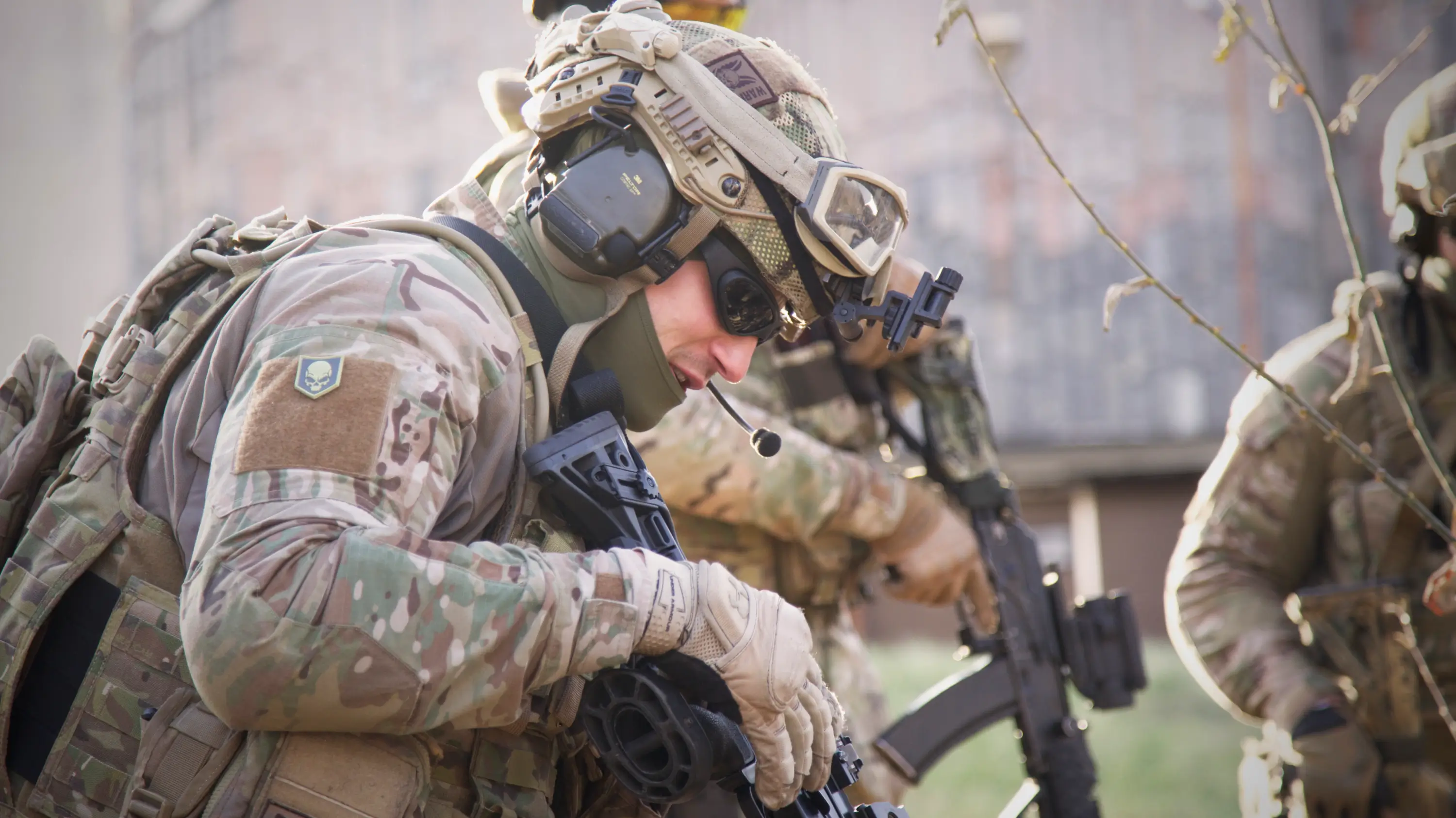
Few branding problems carry more weight – or more contradiction – than a name that already means everything. The Kalashnikov name is inseparable from the AK-47: a weapon that appears on a national flag, in decades of conflict imagery, and in the cultural vocabulary of every market the company needed to enter.
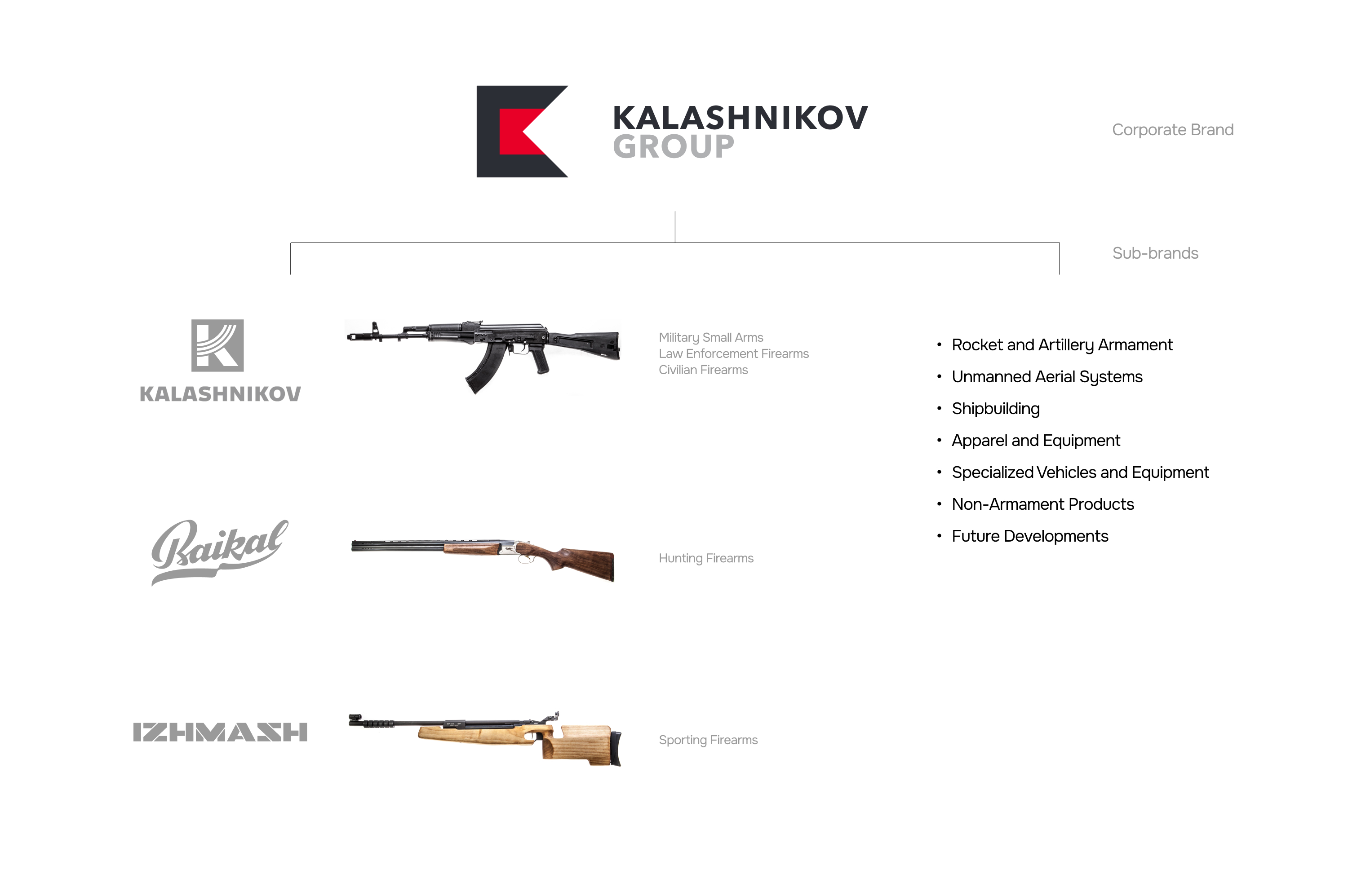
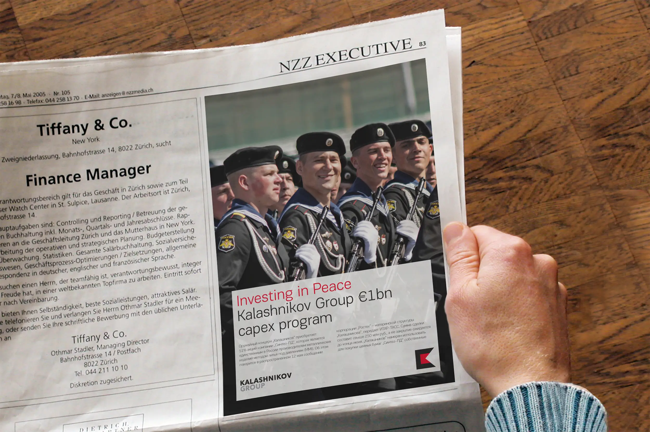
By 2014, the group had completed a major structural transformation – consolidating multiple production assets, preparing for civilian markets, and moving toward international positioning. The rebrand was not cosmetic. It was a signal: Kalashnikov was redefining itself as a modern industrial corporation – not merely a manufacturer trading on legacy. The new brand had to address military procurement, civilian retail, and international partners simultaneously, without contradiction.
Insight
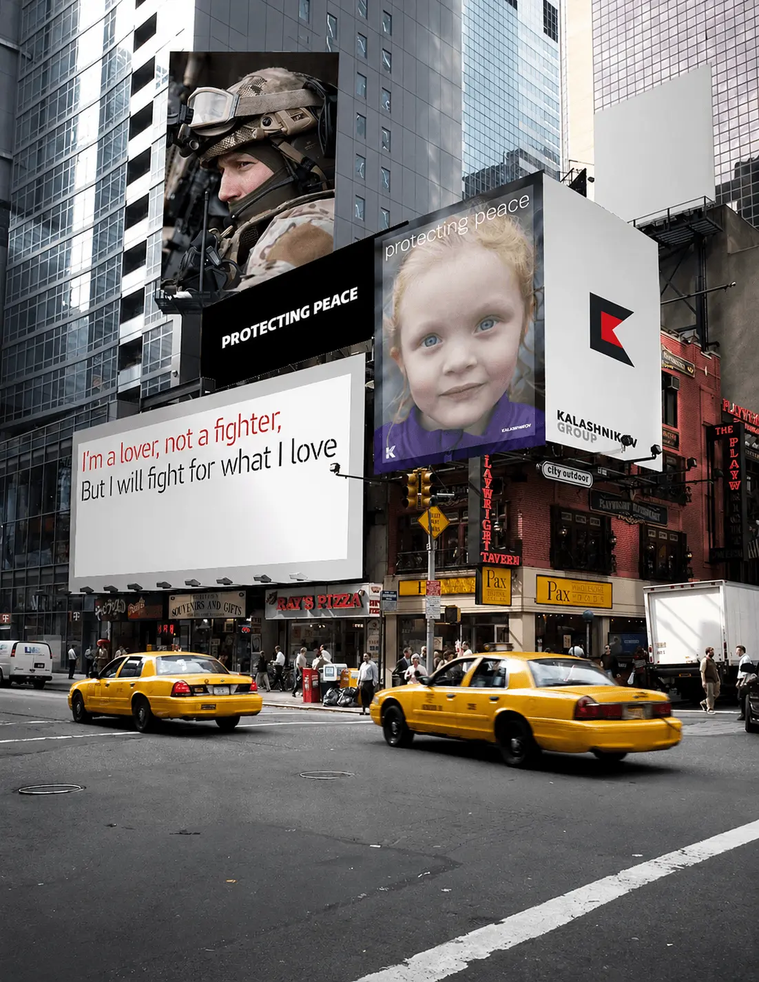
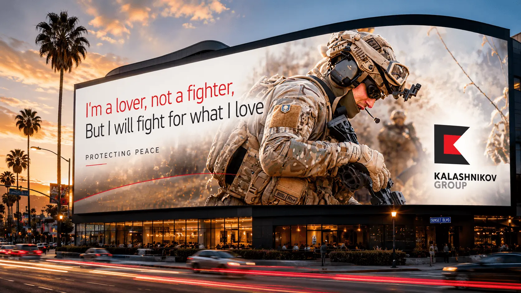
The concept is: «I'm a lover, not a fighter. But I will fight for what I love» Protecting peace. The tension in the brief was real: a weapon is associated with conflict. But the people who carry weapons – soldiers, law enforcement officers, civilians – carry them for reasons that are fundamentally about protection, not aggression.
The insight: a weapon is not an instrument of war. It is an instrument of peace in the hands of the person responsible for keeping it. This reframe is not a marketing softening – it is structurally accurate. And it gave the brand a platform that could speak with equal authority to a procurement officer at the Ministry of Defence and a civilian buyer in a legal firearms market.
Brand Platform
Idea: Weapon of Peace. Vision: A weapon is called to serve the cause of peace – to uphold justice, dignity, and the right to life. It cultivates in a person courage, vigilance, and a high sense of responsibility. A weapon protects the weak from the strong. With it, a person is capable of ensuring a peaceful future for their family, their people, and their country.
Mission: To create the world's most reliable weapon – combining the latest achievements in engineering with simplicity and ergonomics – making it indispensable for every category of user. Values: Reliability · Responsibility · Technological sophistication.
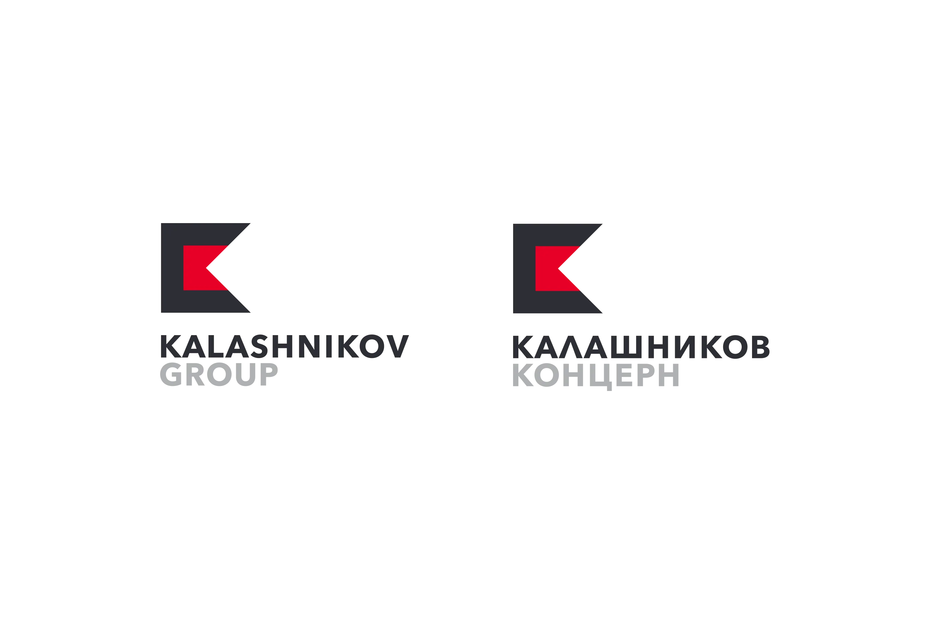
Identity
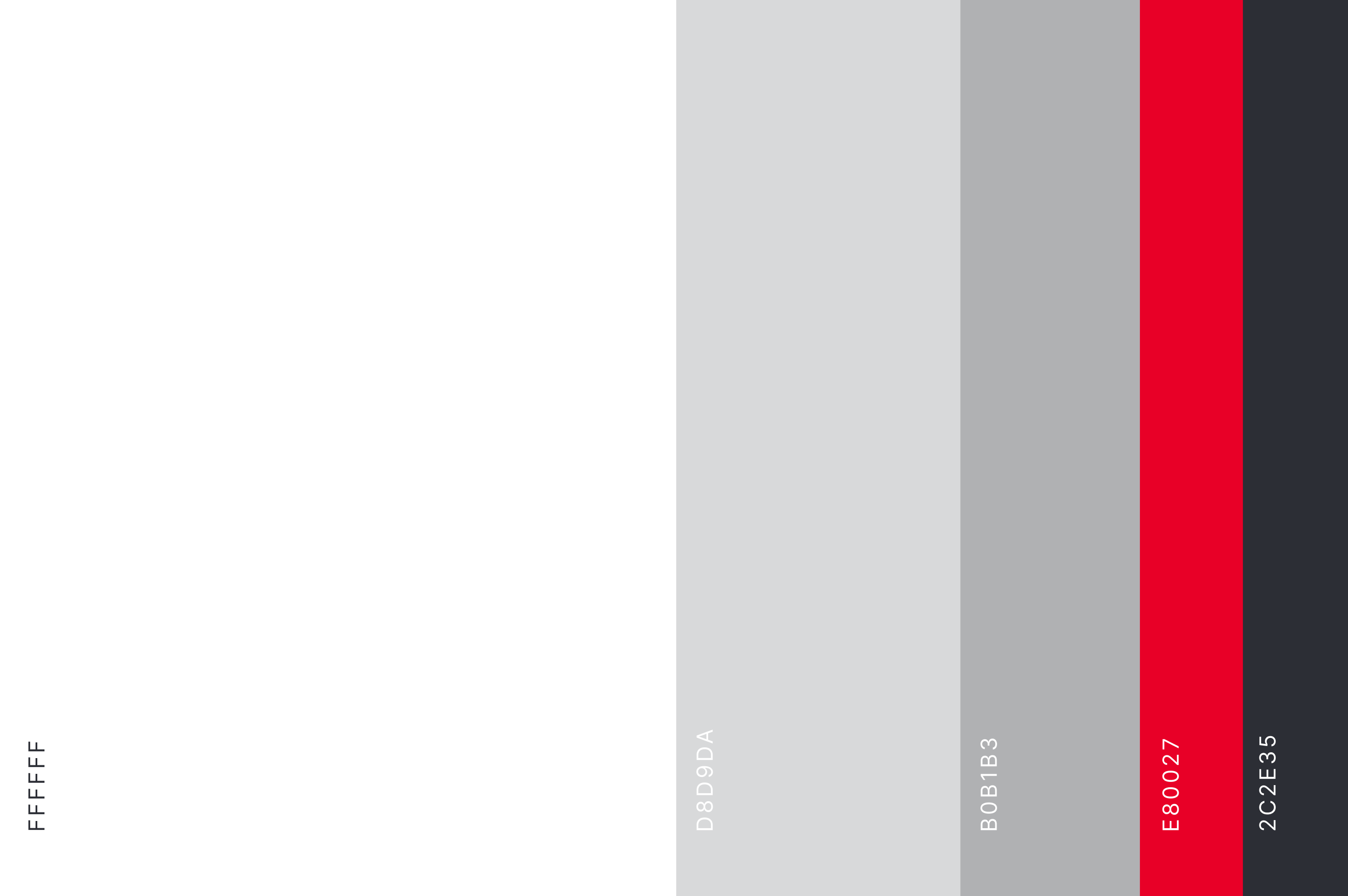
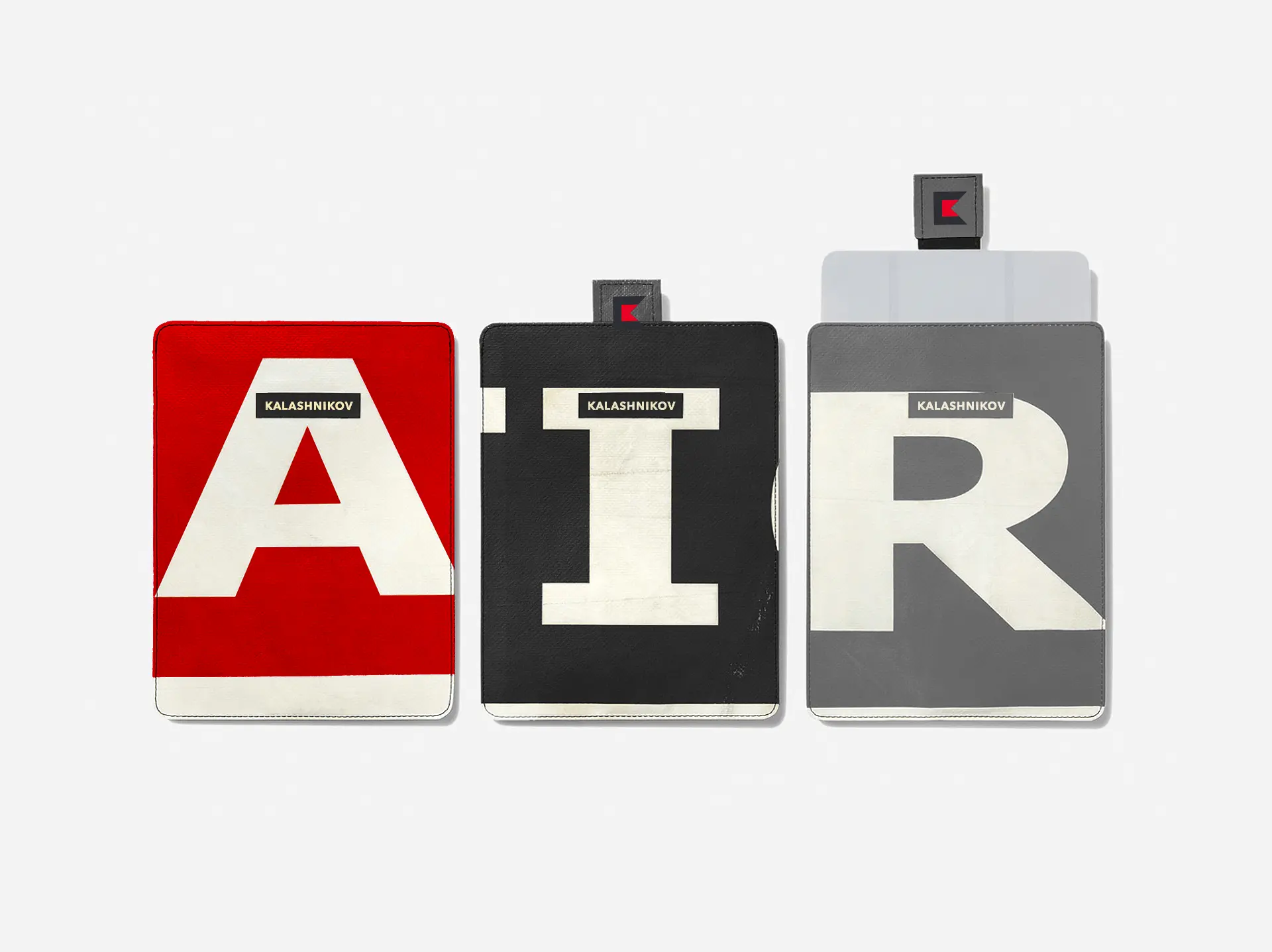
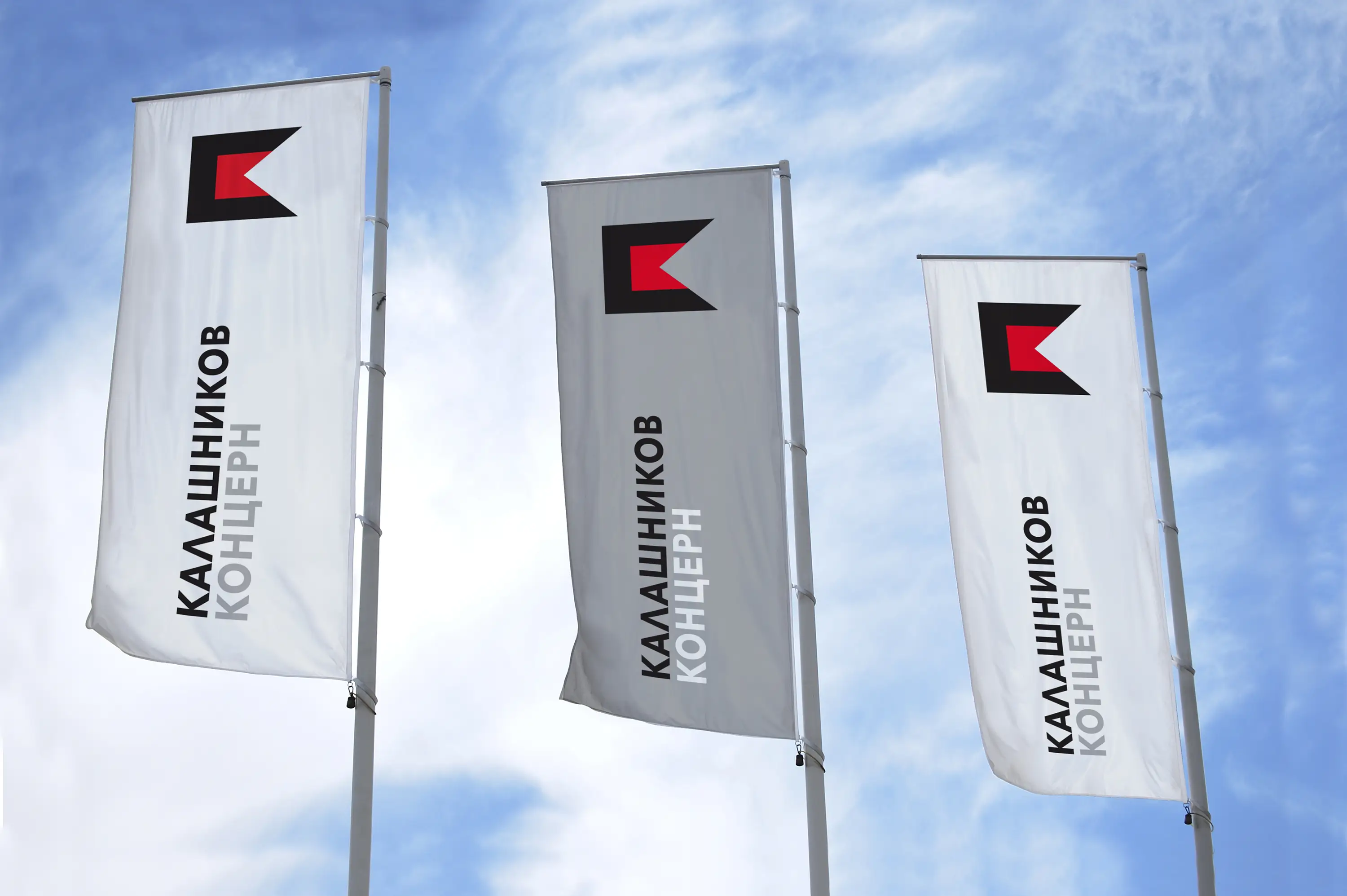
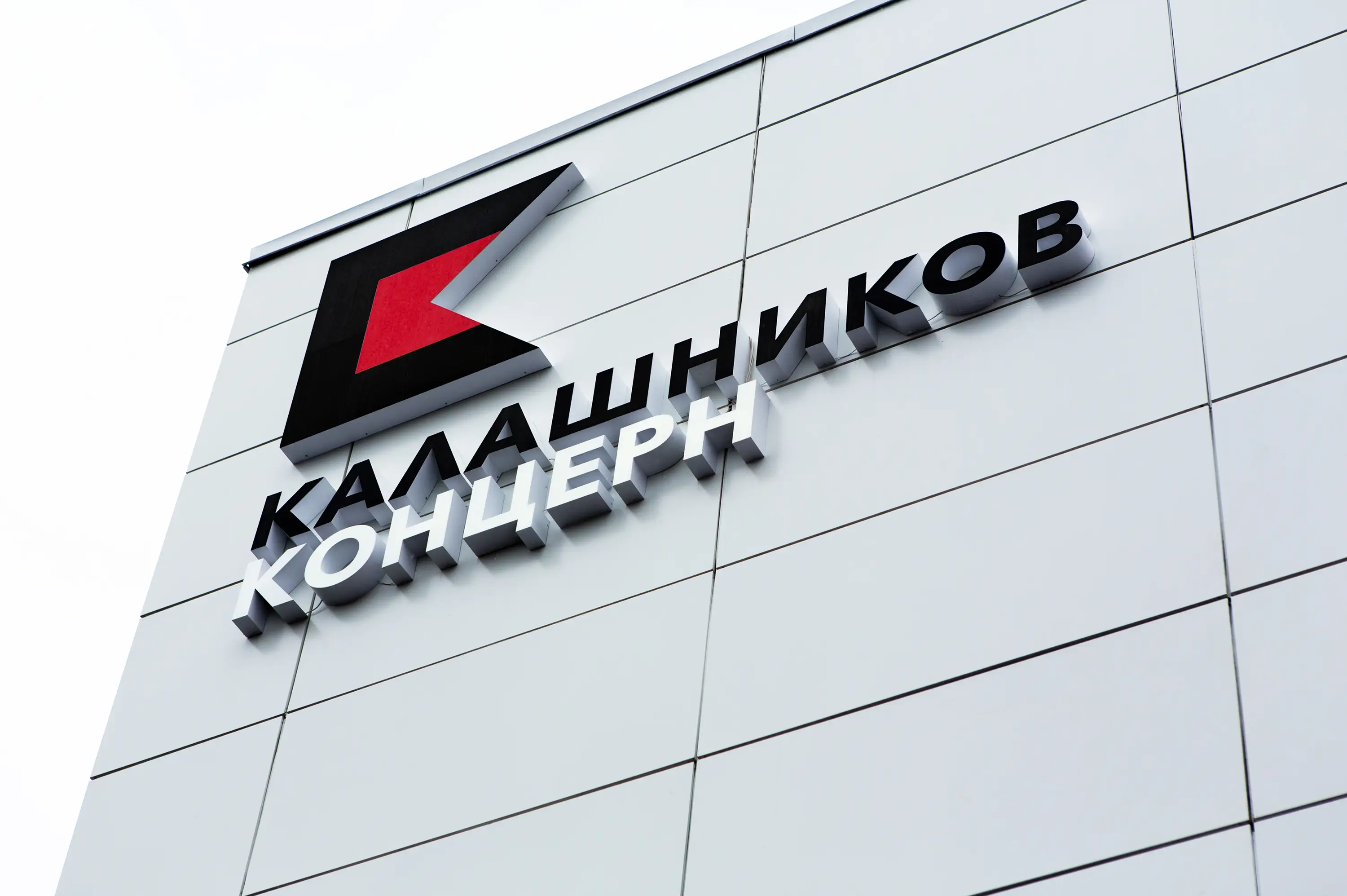
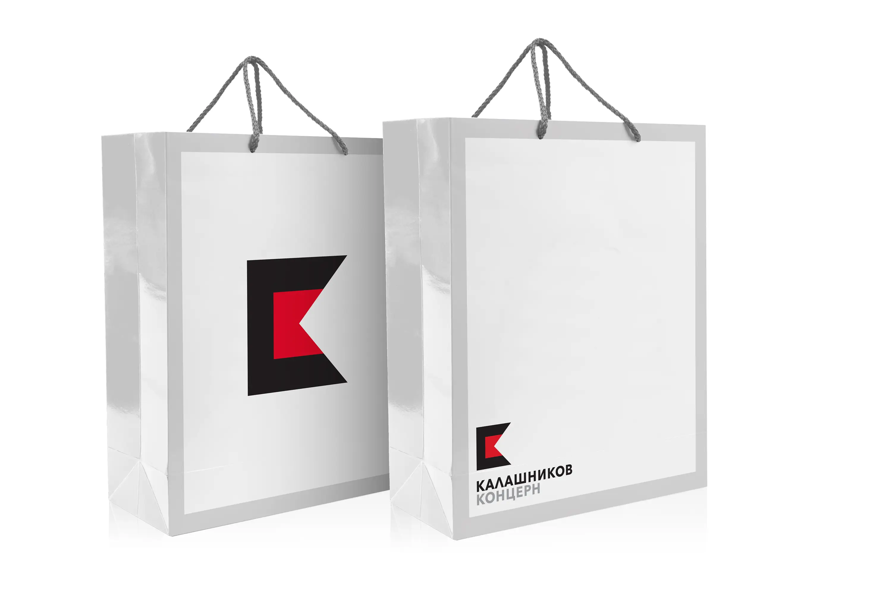
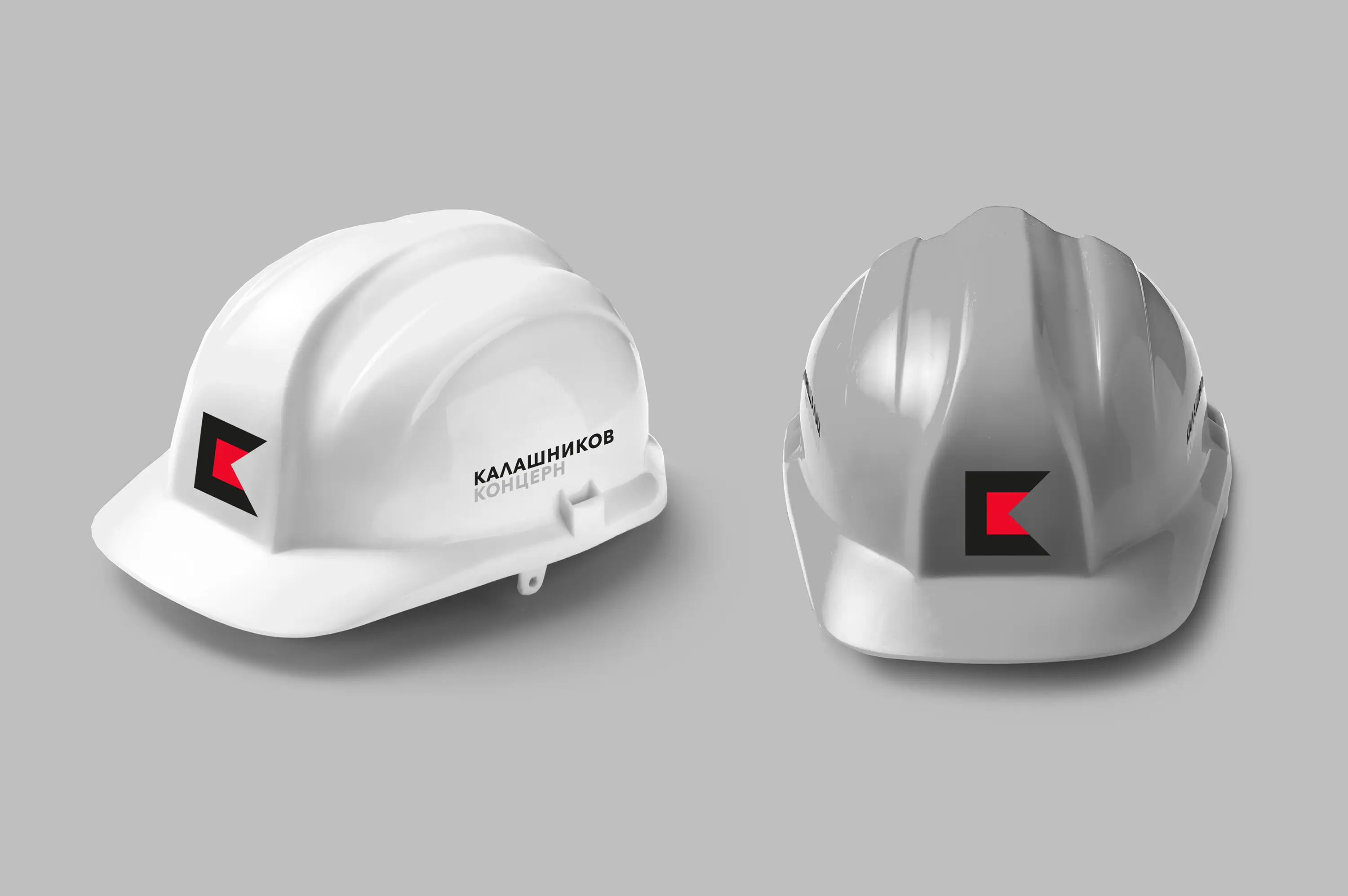
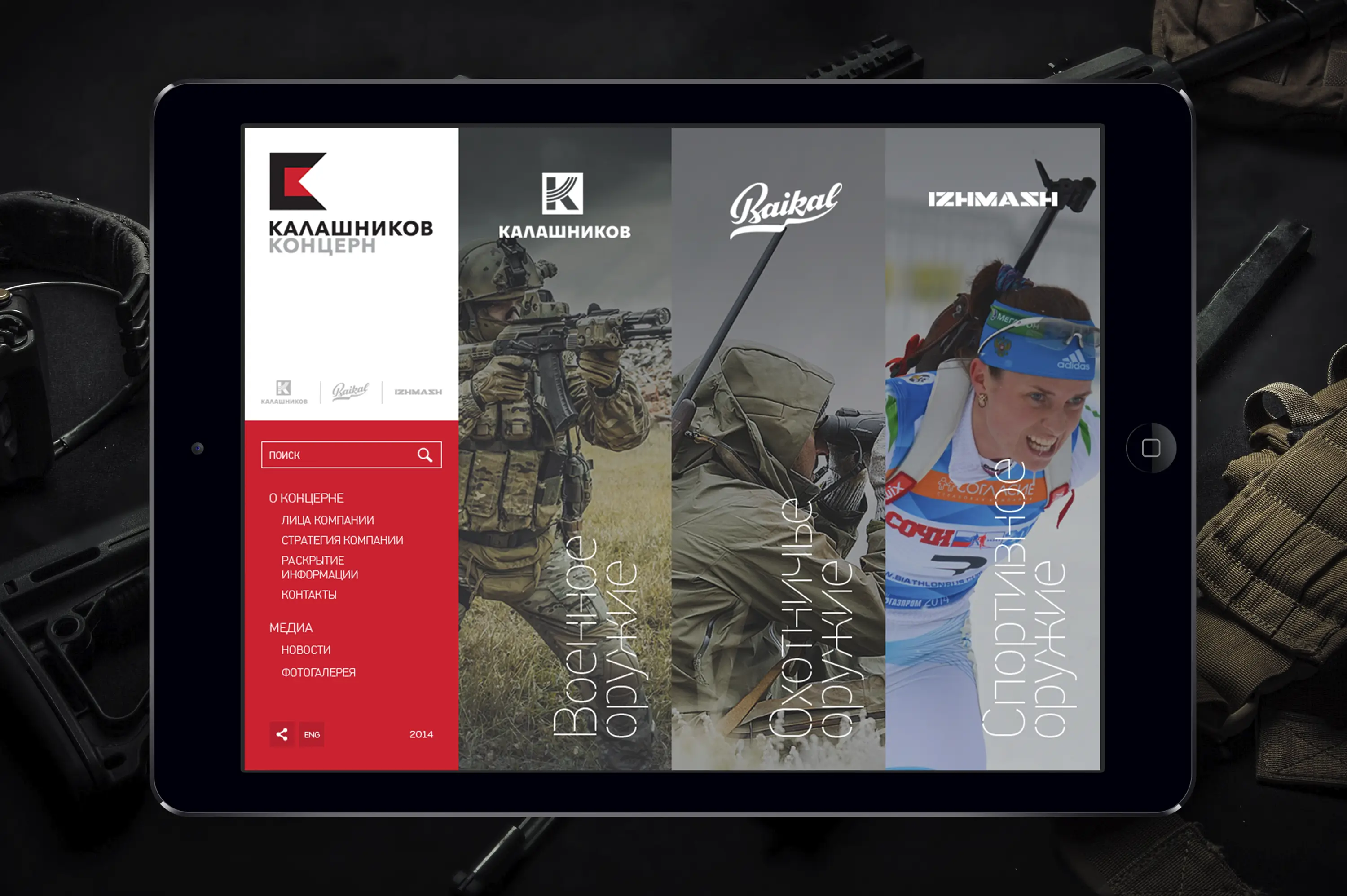
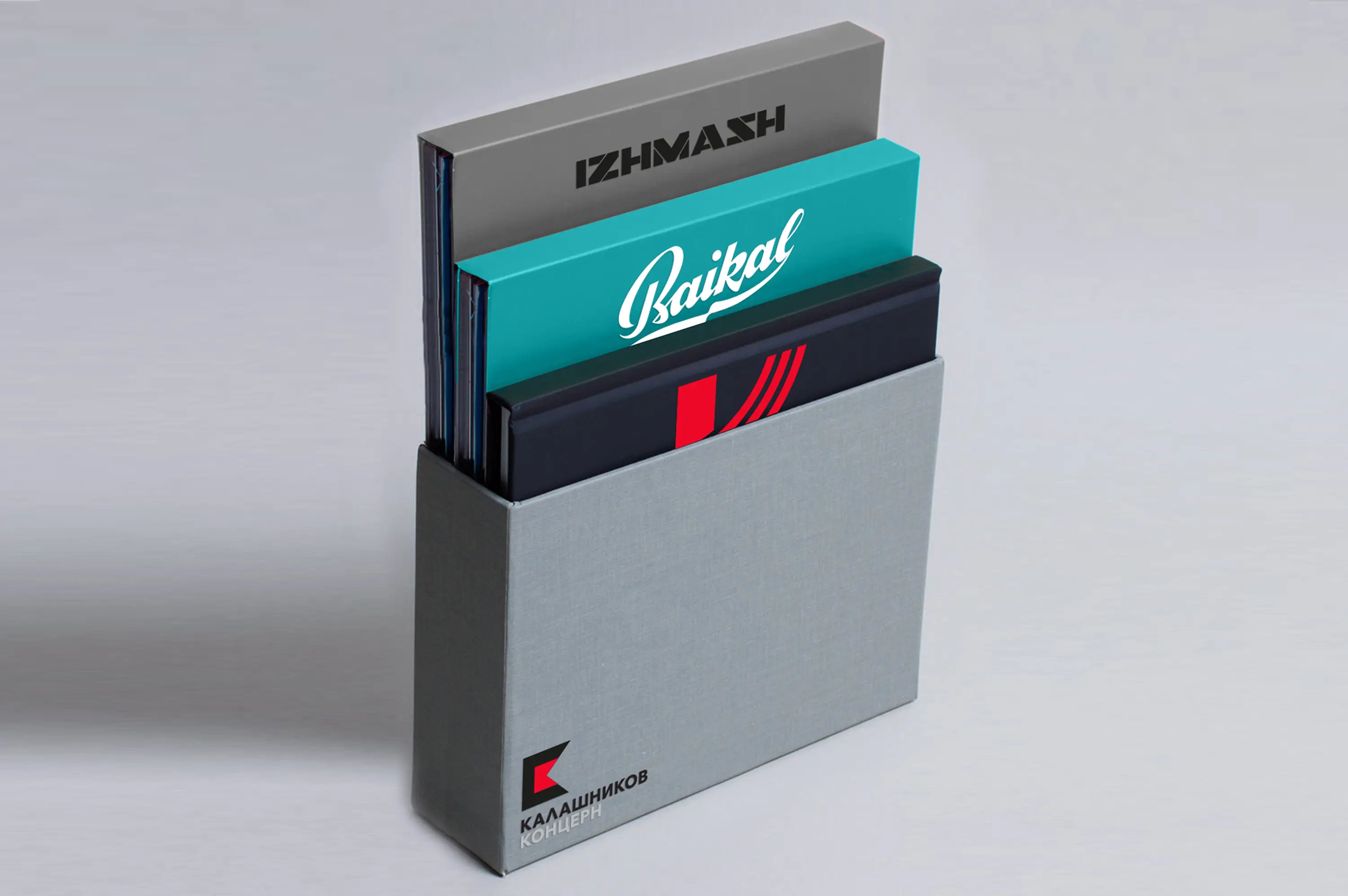
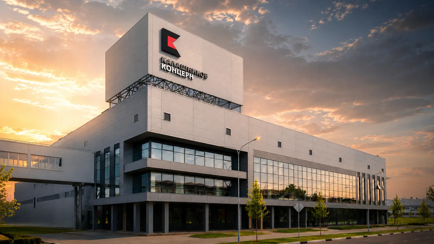
The visual identity translates this platform into a language appropriate for a global industrial institution. The mark is built for longevity and range: it must function with equal authority on technical documentation, on the receiver of a firearm, on an international exhibition stand, on a digital interface, and in press contexts across multiple international markets.
The wordmark and symbol are constructed with precision – every decision calibrated for legibility at all scales, across reproduction methods from laser engraving on metal to large-format outdoor. The system is disciplined, not decorative. It communicates institutional authority through form.
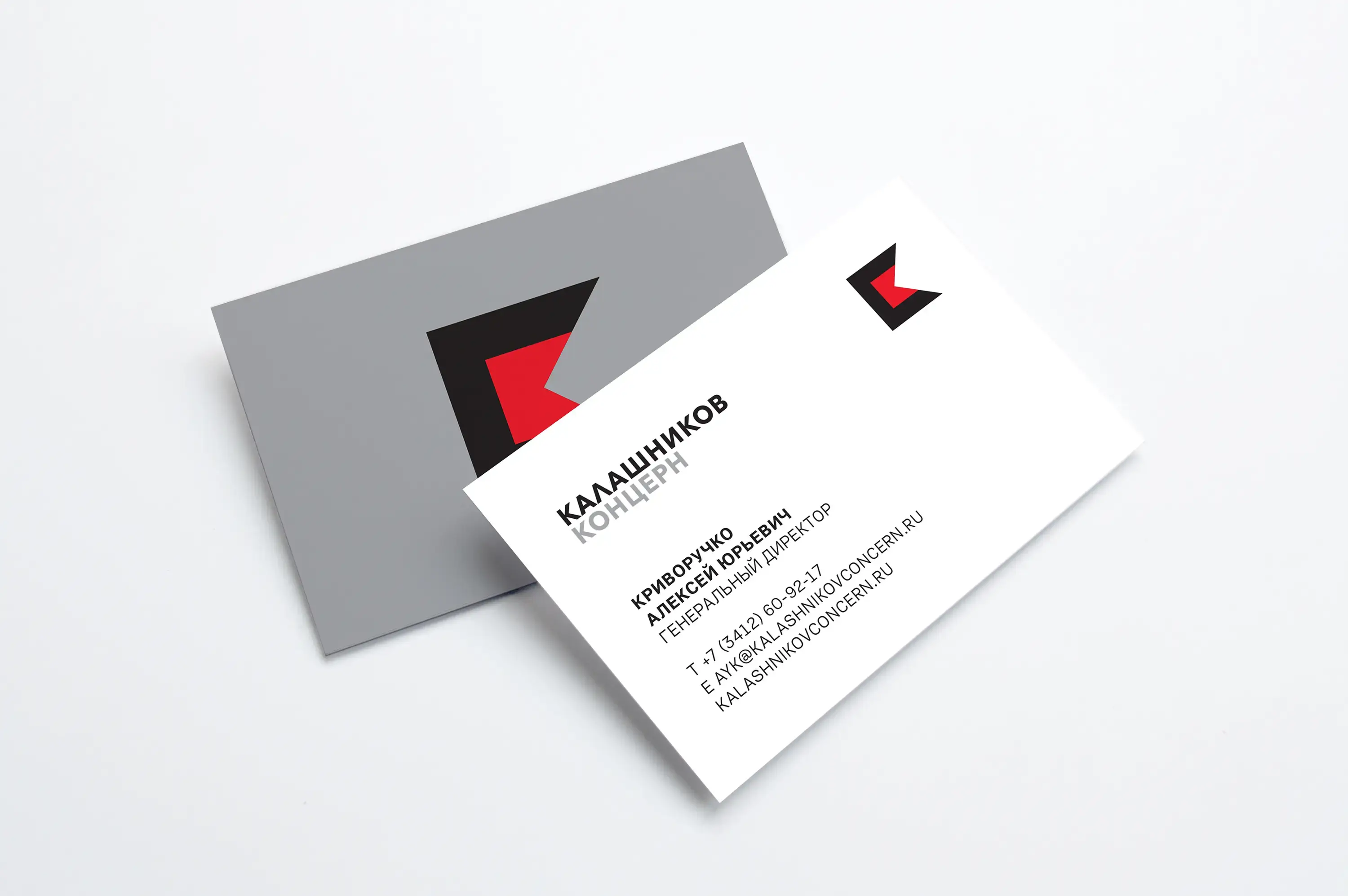
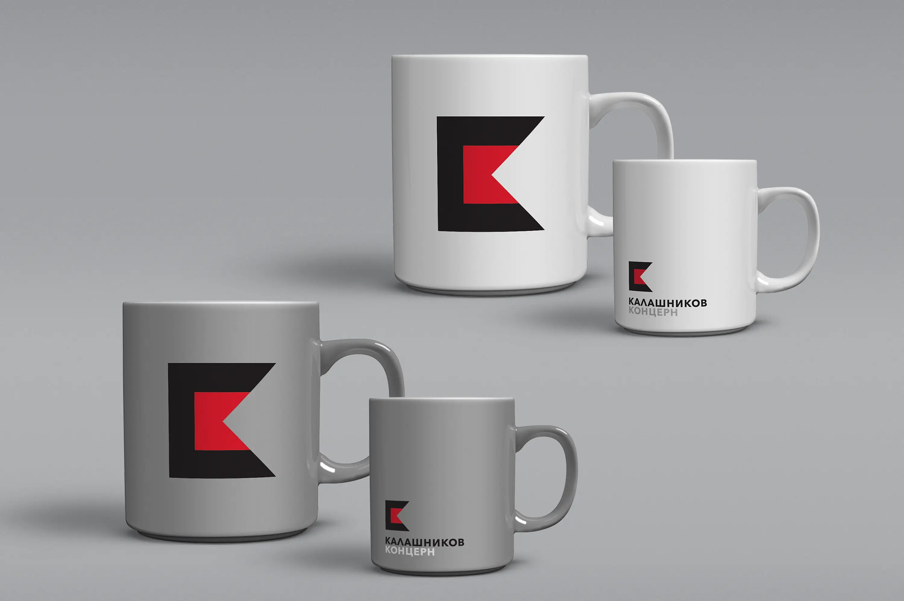
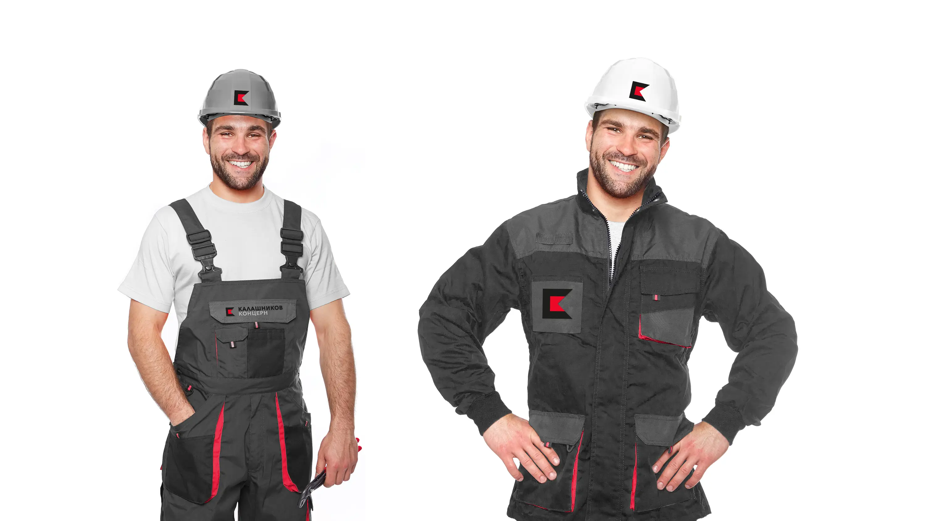
Applications
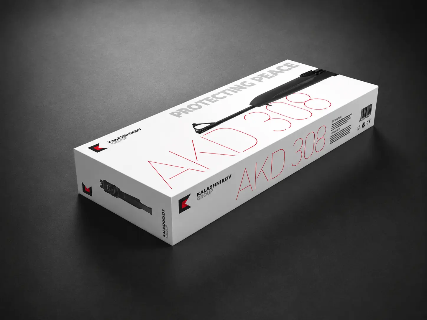
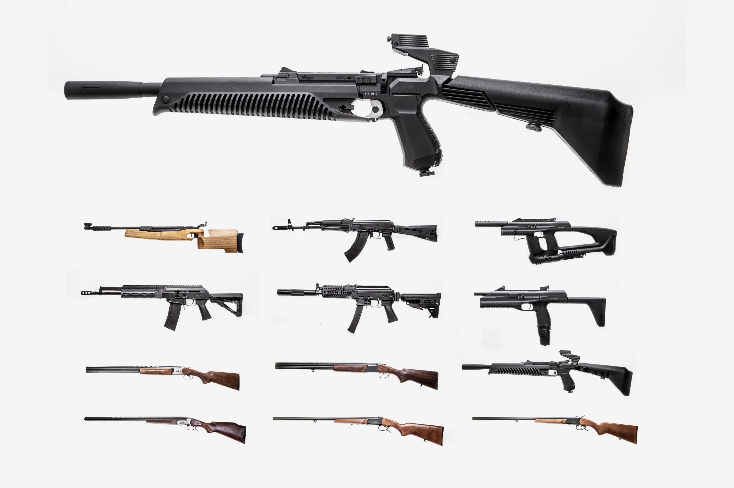
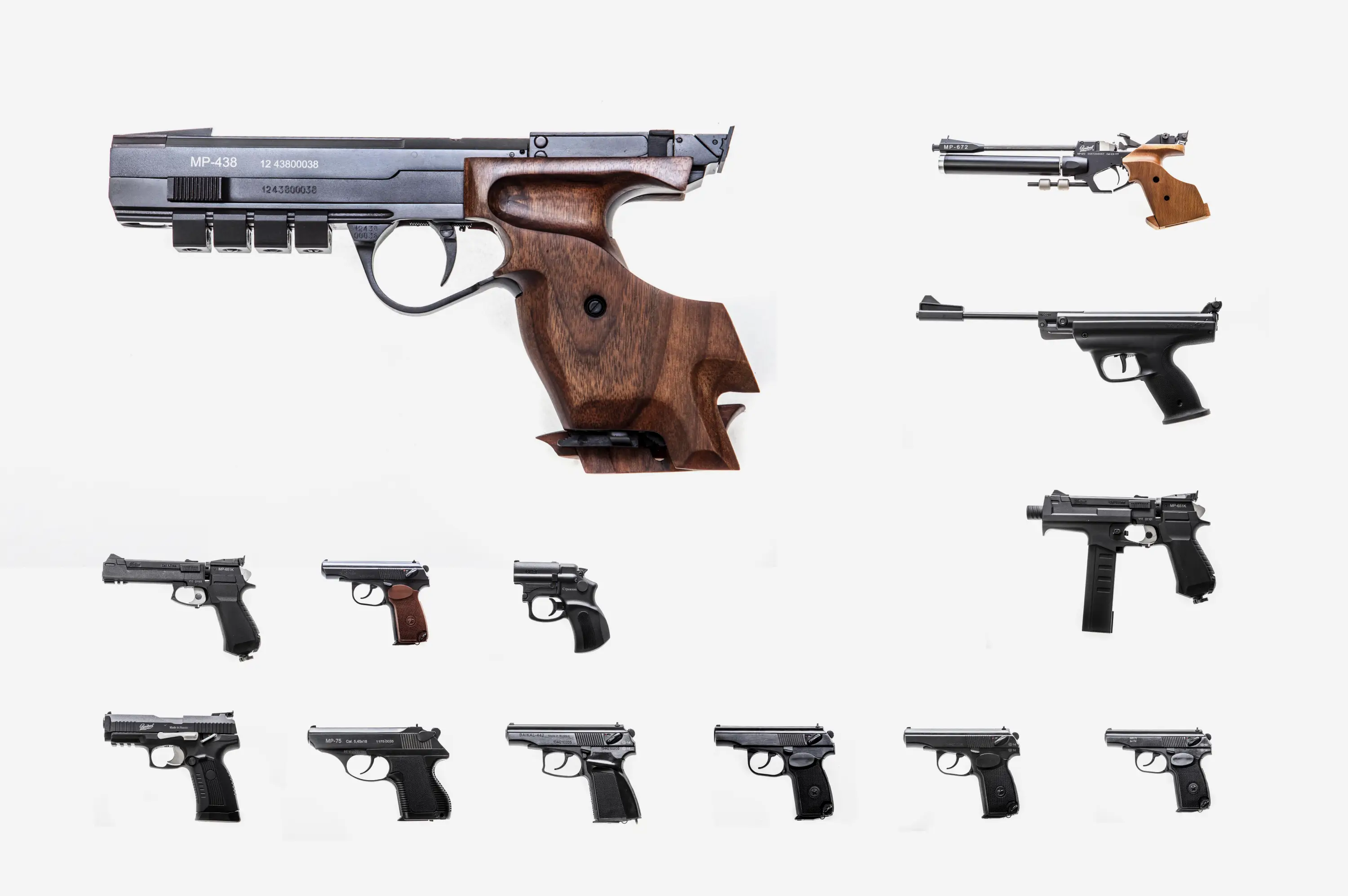
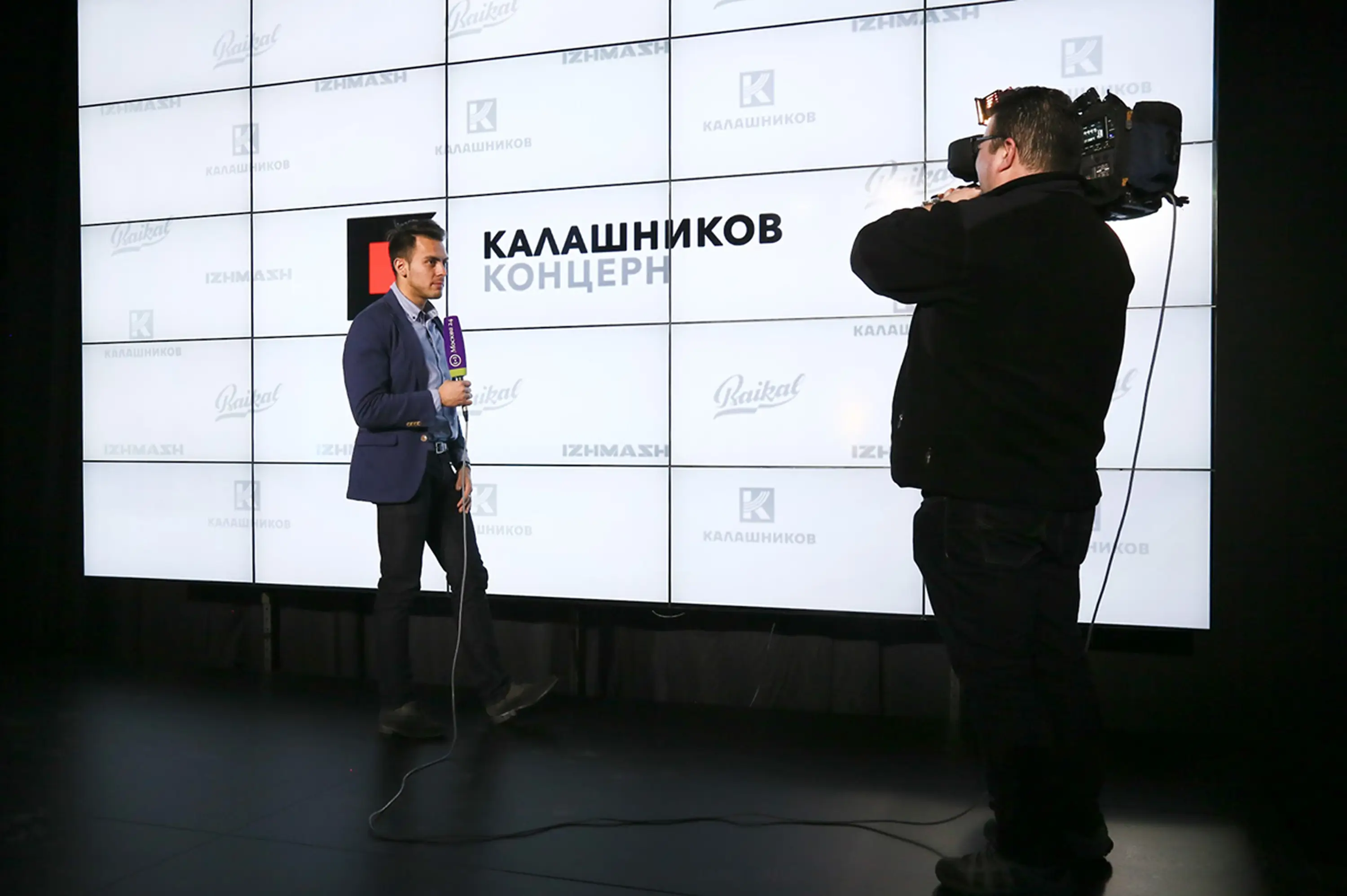
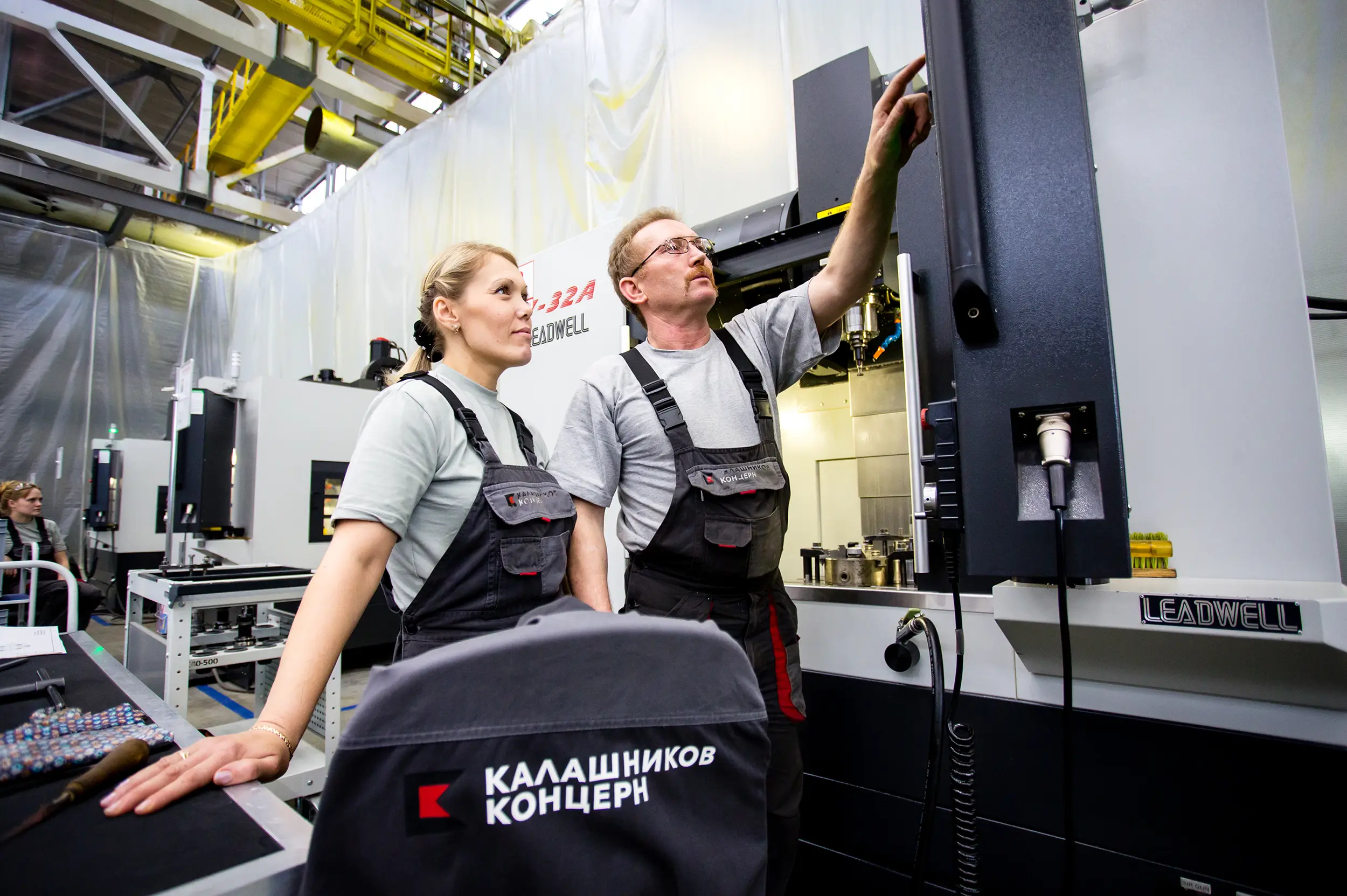
Corporate identity · Stationery · Exhibition design · Communication materials · Website · Product communication · Merchandise · Uniform and workwear. From the wordmark applied to a firearm receiver to the signage at an international defence exhibition.
Result
The brand launched in 2015 and has remained unchanged since – a mark of structural soundness and the stability of the platform it rests on. The group has actively defended the brand in over 30 countries, confirming its commercial and legal significance at the international level. The logo I designed in 2015 has not been revised since. In this category, that is the result.