Challenge
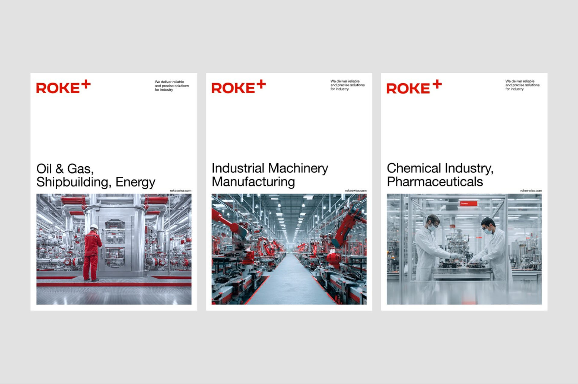
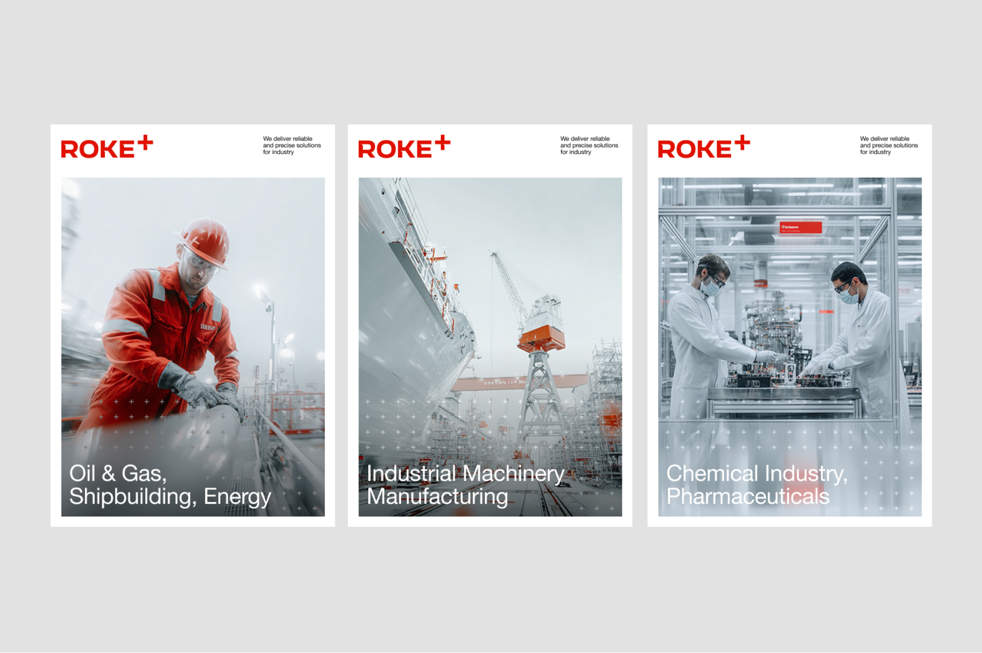
ROKE Swiss was created to enter one of the most demanding categories in industrial B2B: precision fittings and valves for oil & gas, pharma, chemicals, energy, and shipbuilding – industries where a single failed connection can shut down a refinery or contaminate a pharmaceutical line.
The market is dominated by names that took half a century to build trust: Swagelok, Parker, Hy-Lok. Procurement engineers don't experiment – they specify what they know. The brief was to create a brand capable of standing next to those incumbents in an engineer's catalogue and being chosen from day one, without the price tag of a legacy supplier and without pretending to be one.
A second layer: the brand had to operate across three Swiss language regions and lay the foundation for expansion into the Middle East.
Insight
Procurement engineers don't buy stories. They buy specifications they can defend in a meeting. We didn't position as a premium challenger – that invites direct comparison to Swagelok. We didn't position as a low-cost alternative – that signals corner-cutting in a category where corner-cutting kills people.
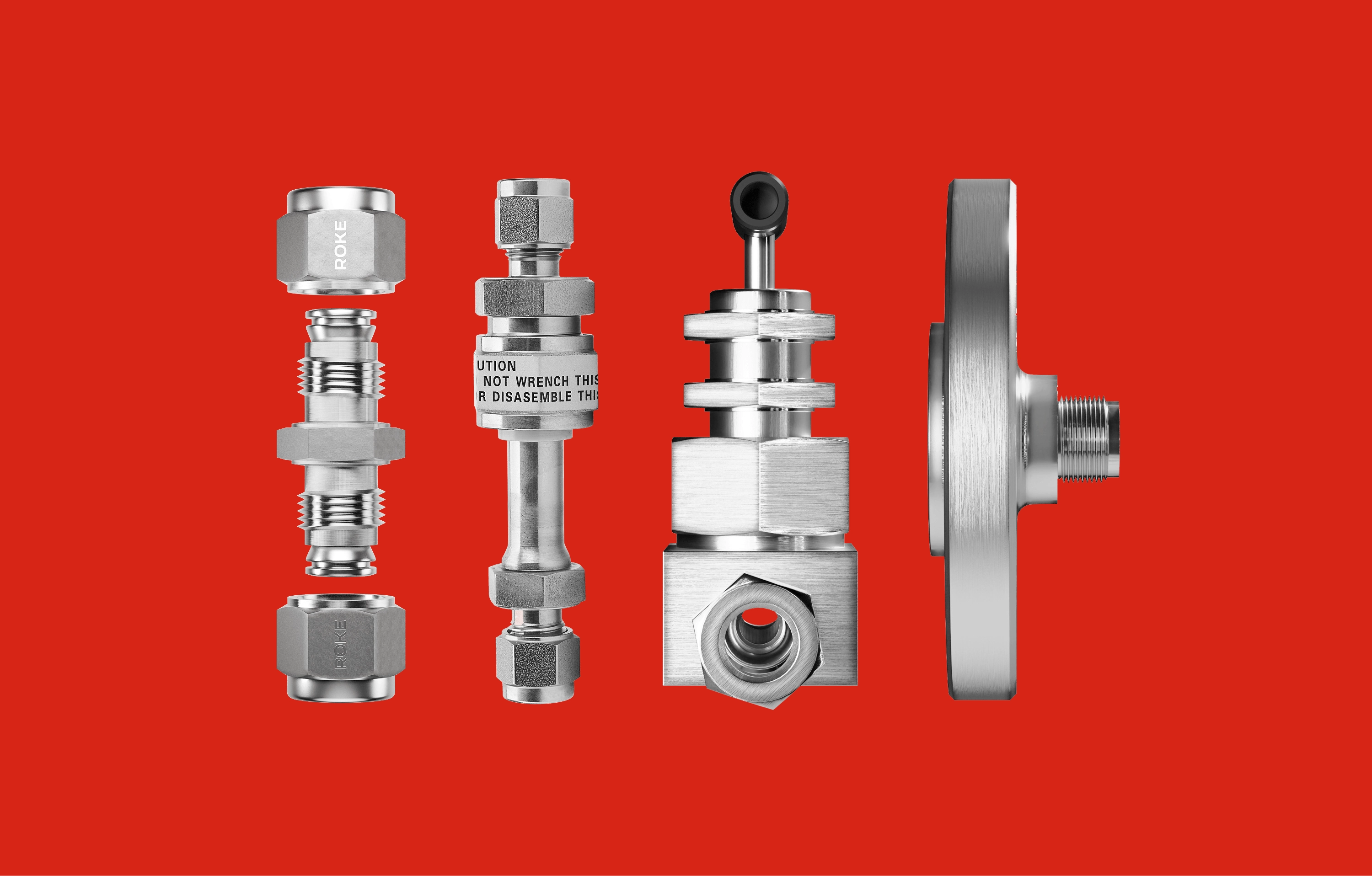
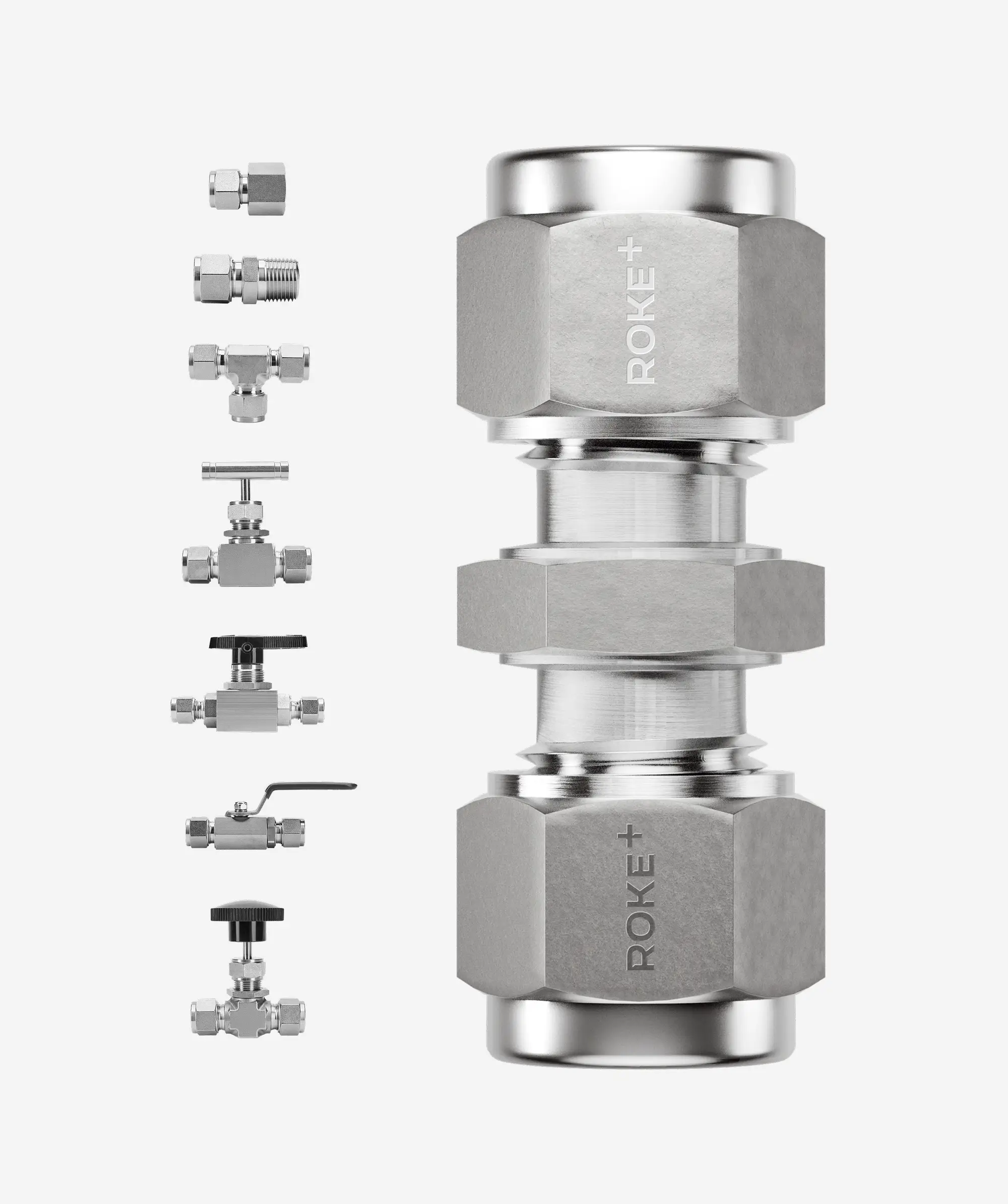
The gap was inside the buyer's own logic: same DIN/ISO standards, same 316L stainless steel, same interchangeability with Swagelok and Hy-Lok dimensions, faster delivery from a Swiss warehouse, a defensible price. Engineering precision without compromise.
Brand Platform
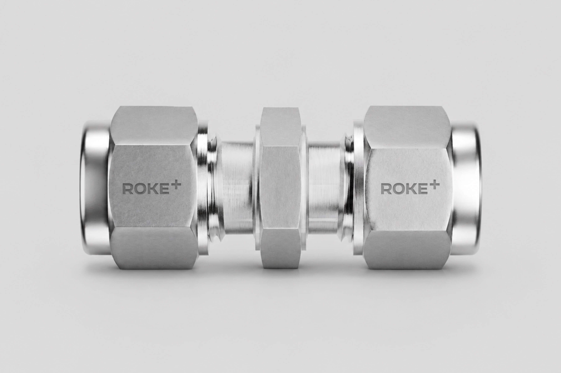
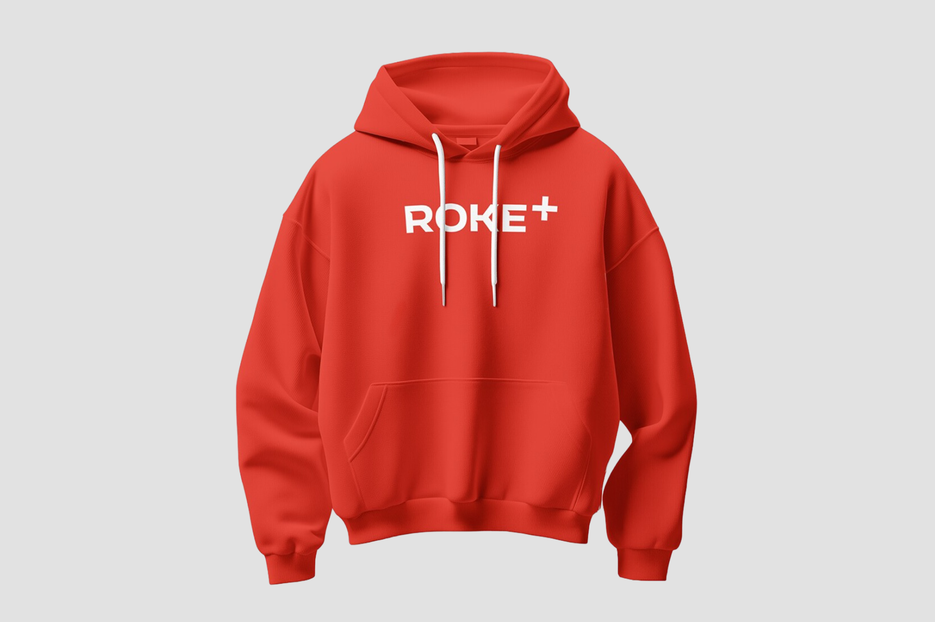
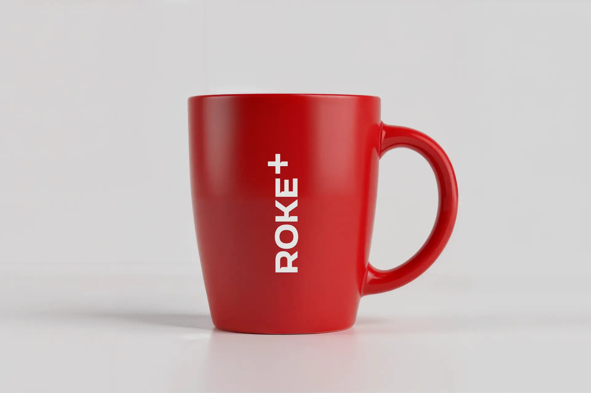
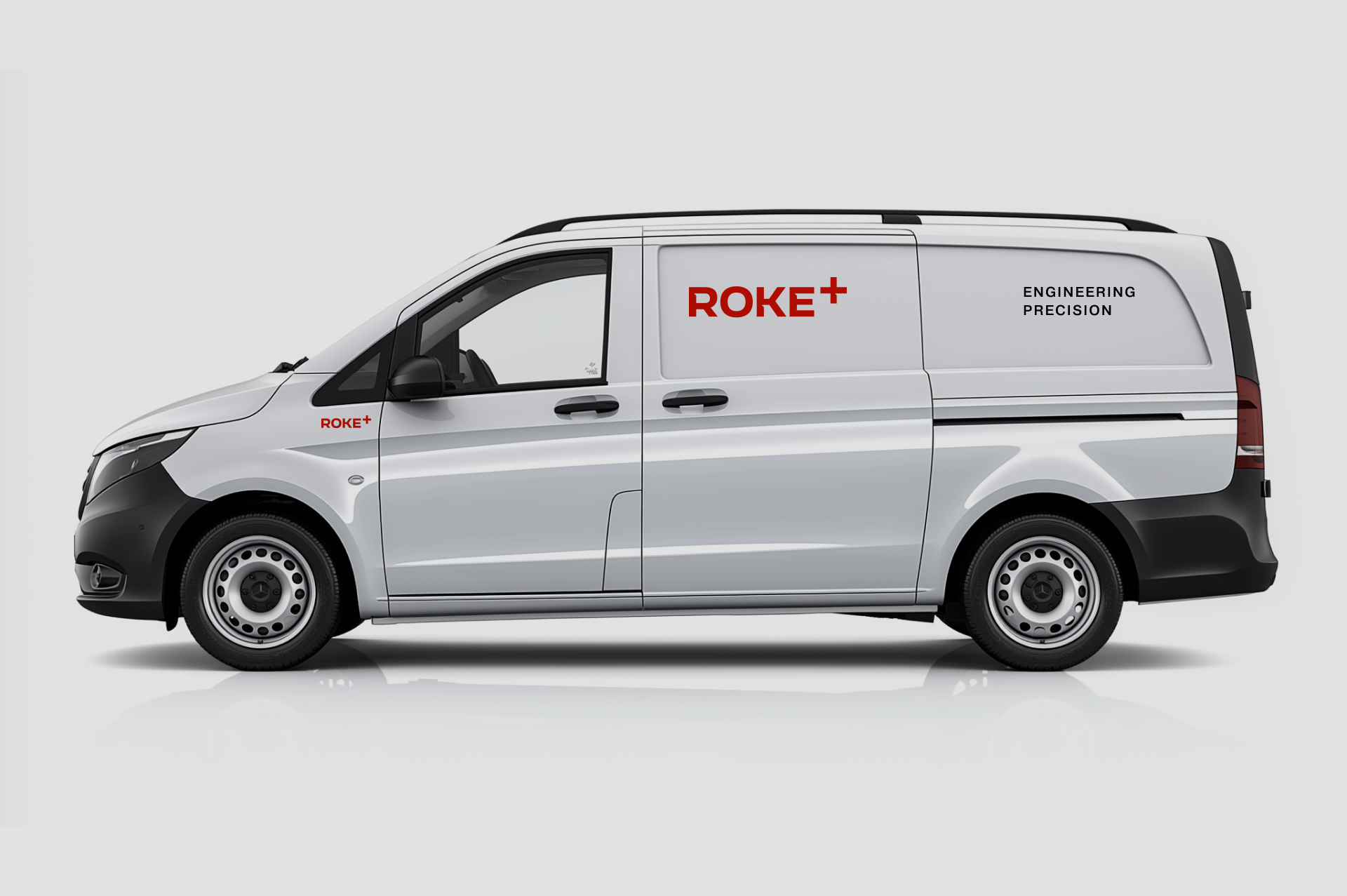
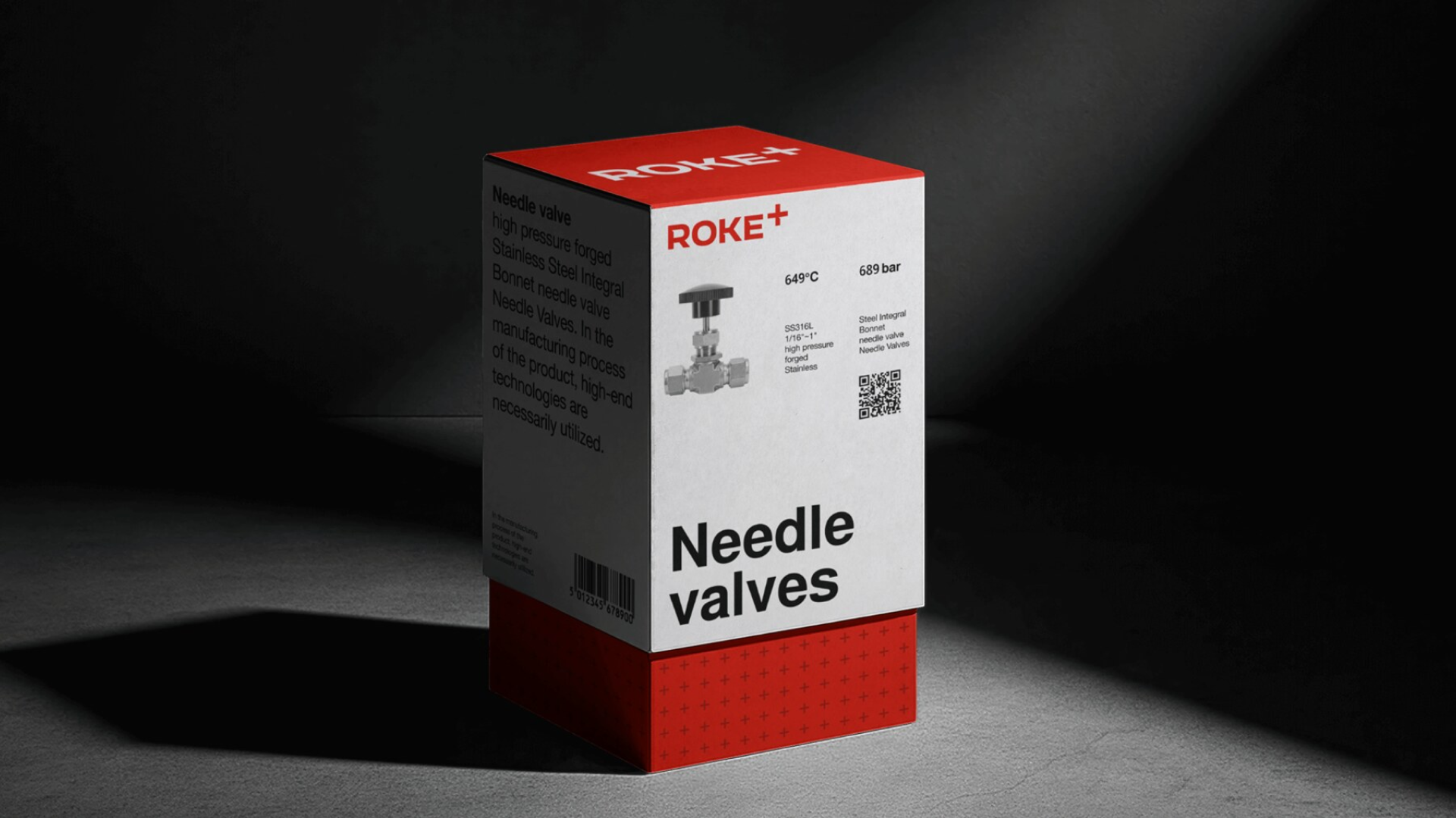
Mission: reliable and precise solutions for industry – without compromise or overpay. Descriptor: Engineering Precision. Character: technical, trustworthy, direct, exact. Values: Precision · Reliability · Efficiency · Customer focus. The "+" reads as expansion, partnership, and precision.
Identity
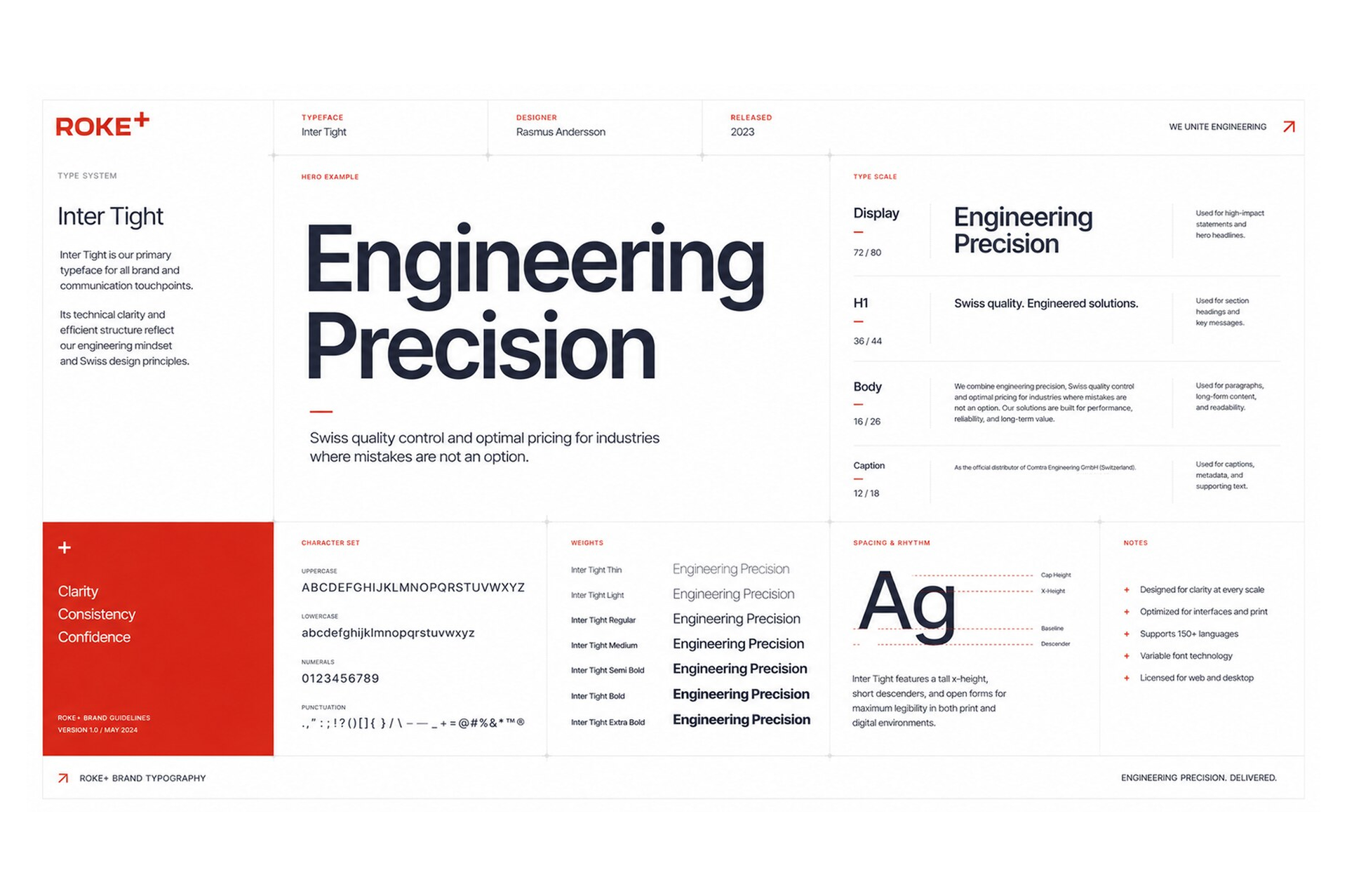
Swiss design wasn't a stylistic preference – it was the closest visual translation of what the product is: precise, disciplined, devoid of decoration, completely focused on function. The identity is built on a strict typographic grid using Inter Tight – neutral, technical, internationally legible across German, French, Italian and English.
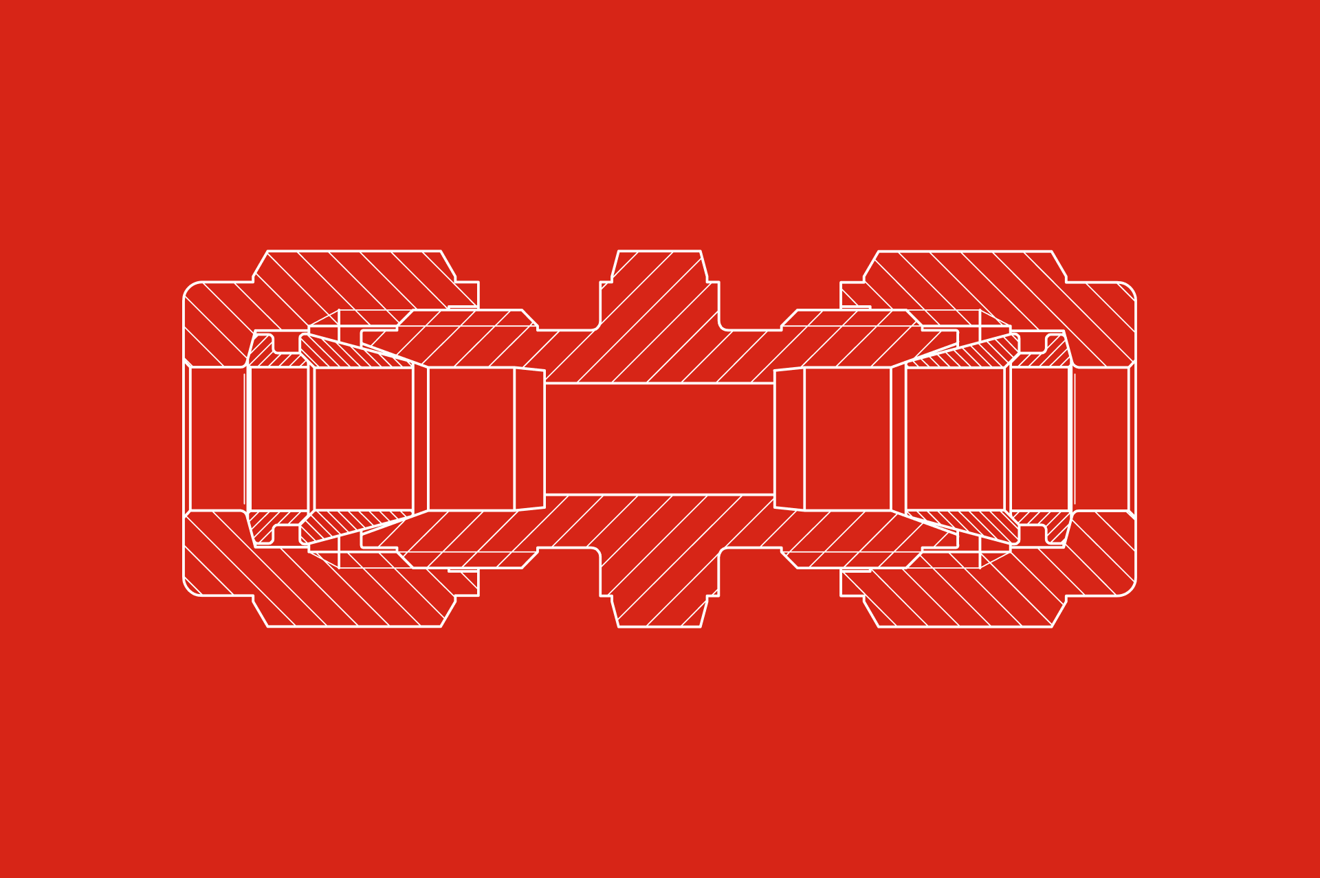
The palette is monochromatic with red used as a functional accent, not decoration: it marks attention, hierarchy, action. In a category where every competitor uses similar metallic photography and steel-grey palettes, narrowness becomes a signal.
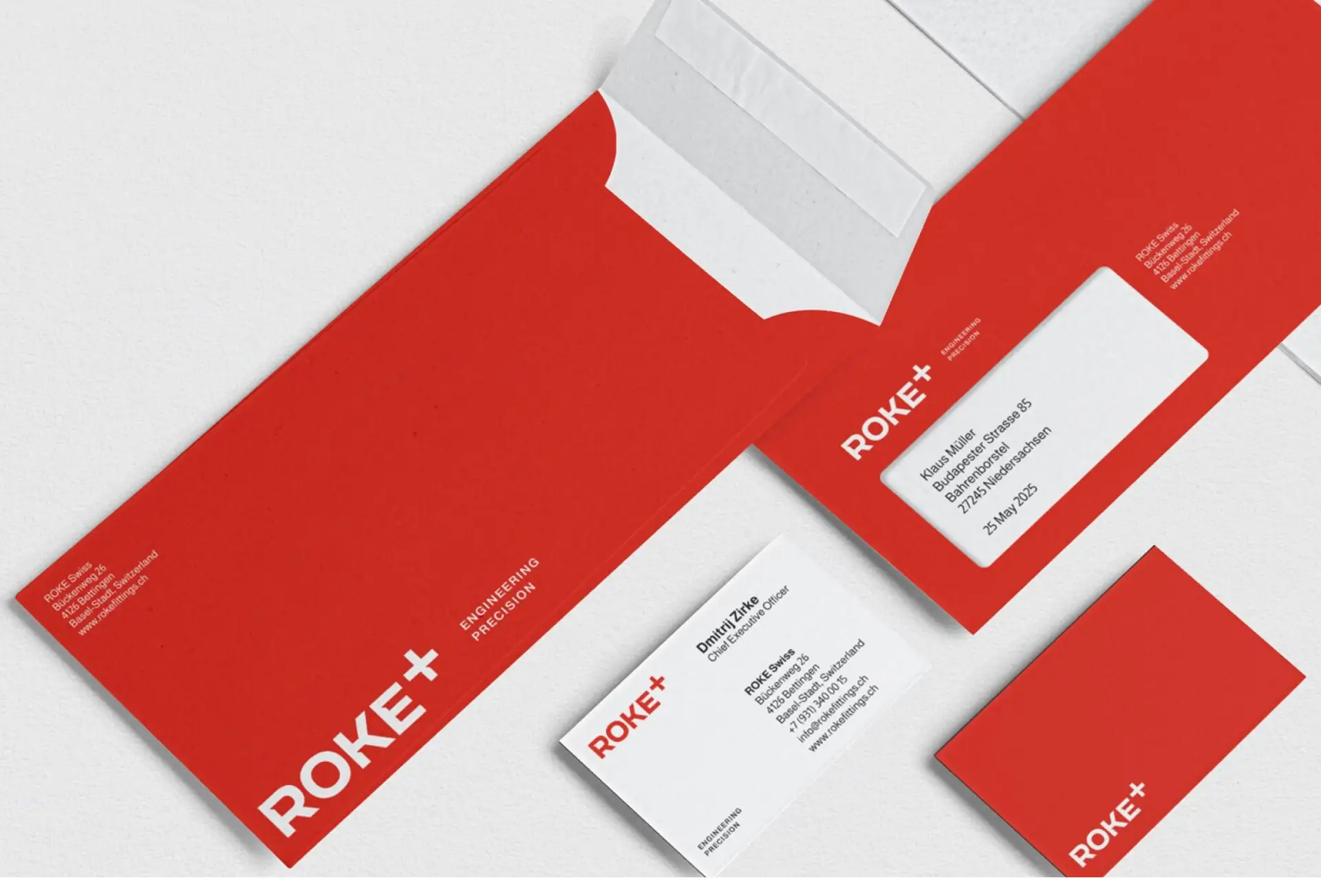
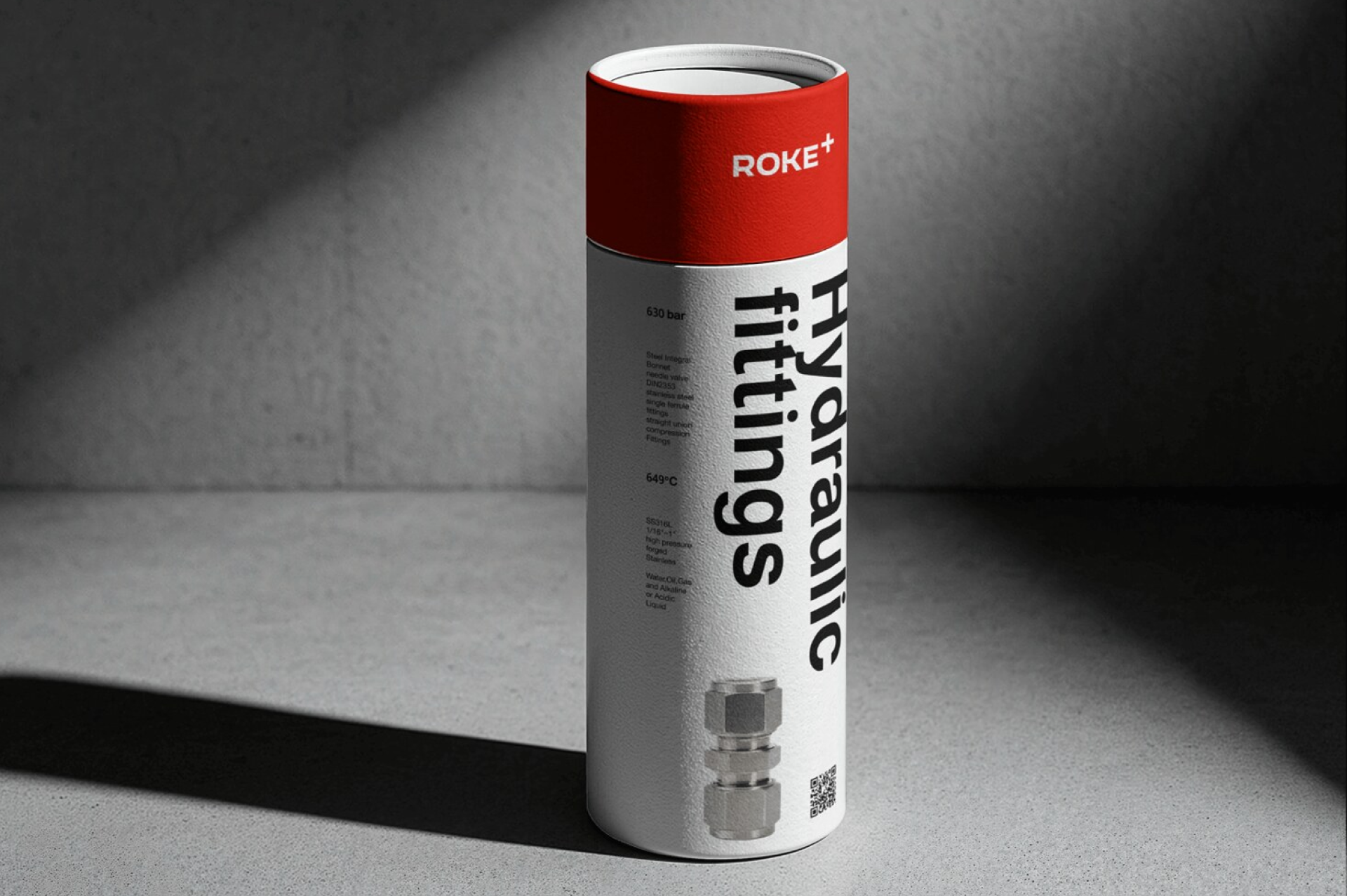
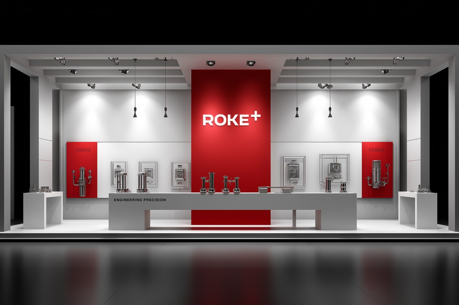
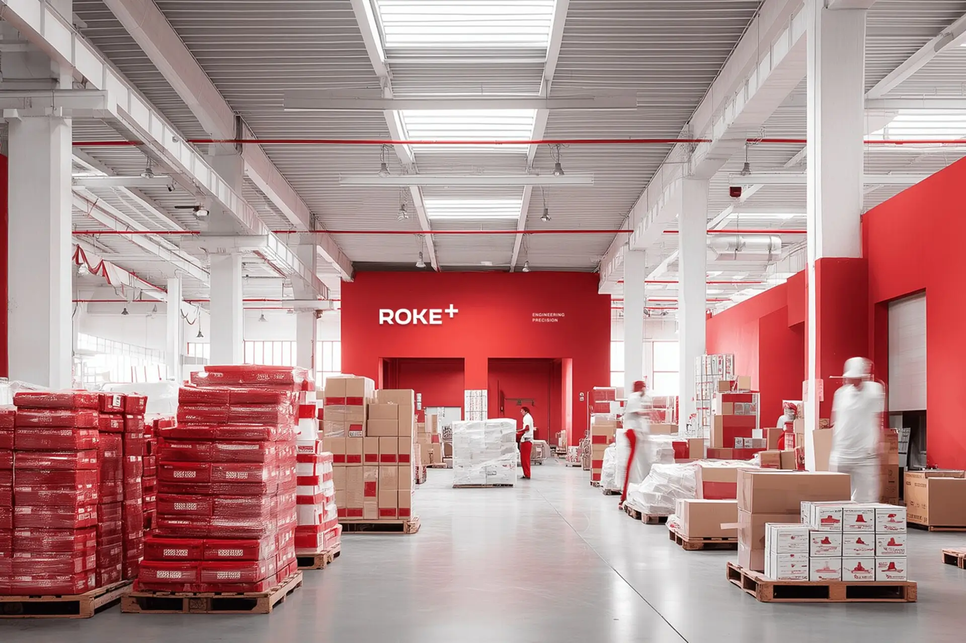
Applications
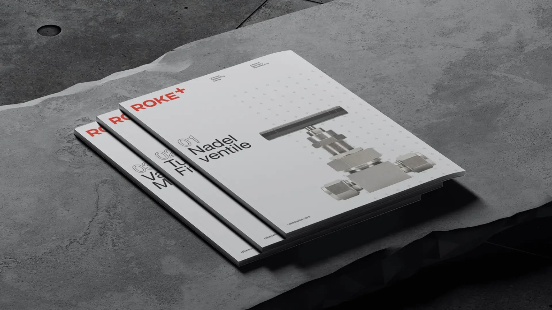
Technical datasheets · Product packaging · Stationery · Corporate magazine · Product catalogue · Merchandise · Exhibition stands · Warehouse signage · Outdoor. Every touchpoint designed to read as the same brand – from the back wall of a warehouse to a trade fair in Hannover.
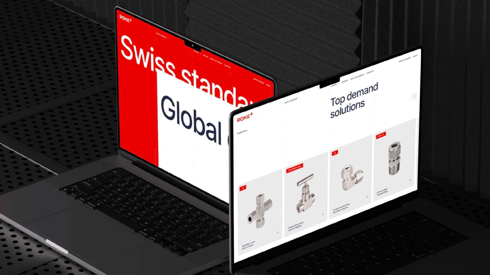
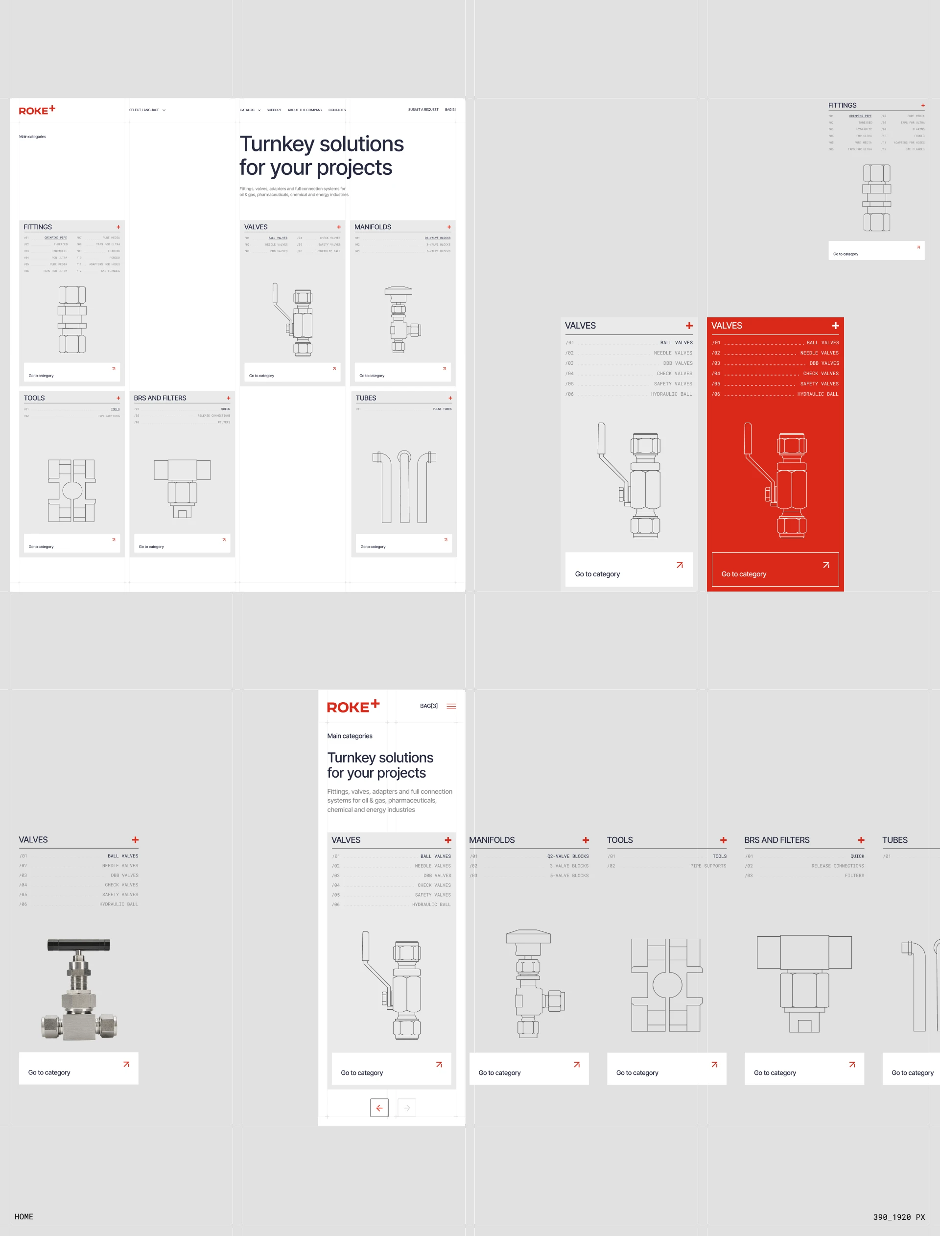
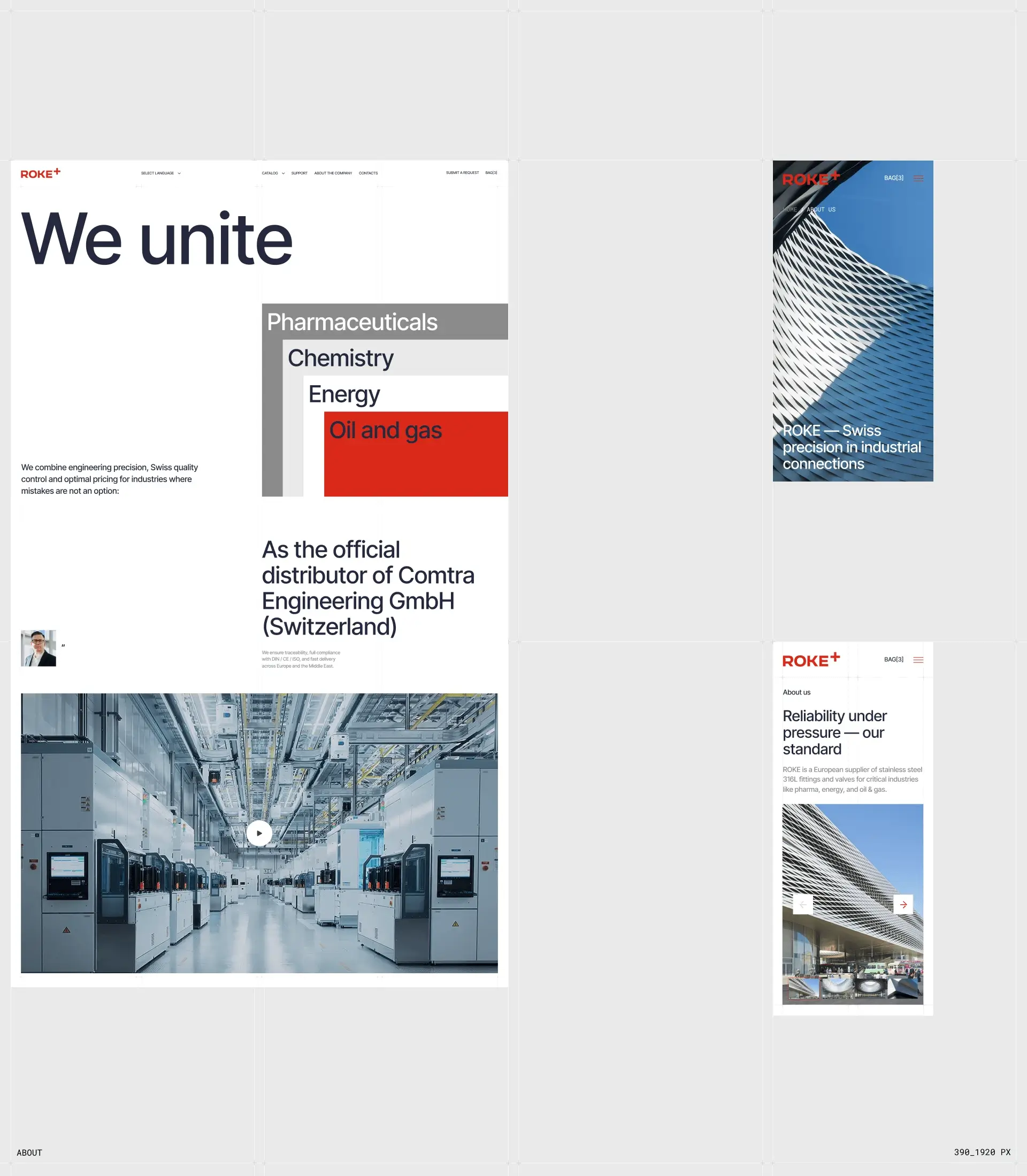
Digital
rokeswiss.com built across four languages – German, French, Italian, English. In B2B industrial supply, a website is a functioning sales tool: a procurement engineer on a tight deadline needs to find a part number, confirm a specification, download a CAD file, and submit a request for quotation in under three minutes. Designed for that workflow.
Result
ROKE+ launched on rokeswiss.com with a complete brand system: identity, voice, packaging, environments, multilingual web, and a go-to-market plan ready for Swiss and EU procurement conversations. The brand holds a defensible position between premium incumbents and economy alternatives – the first credible "engineering precision without overpaying" play in this market segment.