Challenge
From institutional complexity to public clarity.AIJHK was transforming from a mortgage-focused institution into a broader national housing development brand.
Its role was expanding across housing development, mortgage finance, investment, rental housing, land development, infrastructure and public policy. The brand needed to speak to very different audiences at once: government bodies, banks, developers, investors, regulators, regional authorities, media, internal teams and citizens.
The challenge was not to make the institution look more modern. The challenge was to make a complex system easier to understand, trust and use.Strategic Idea
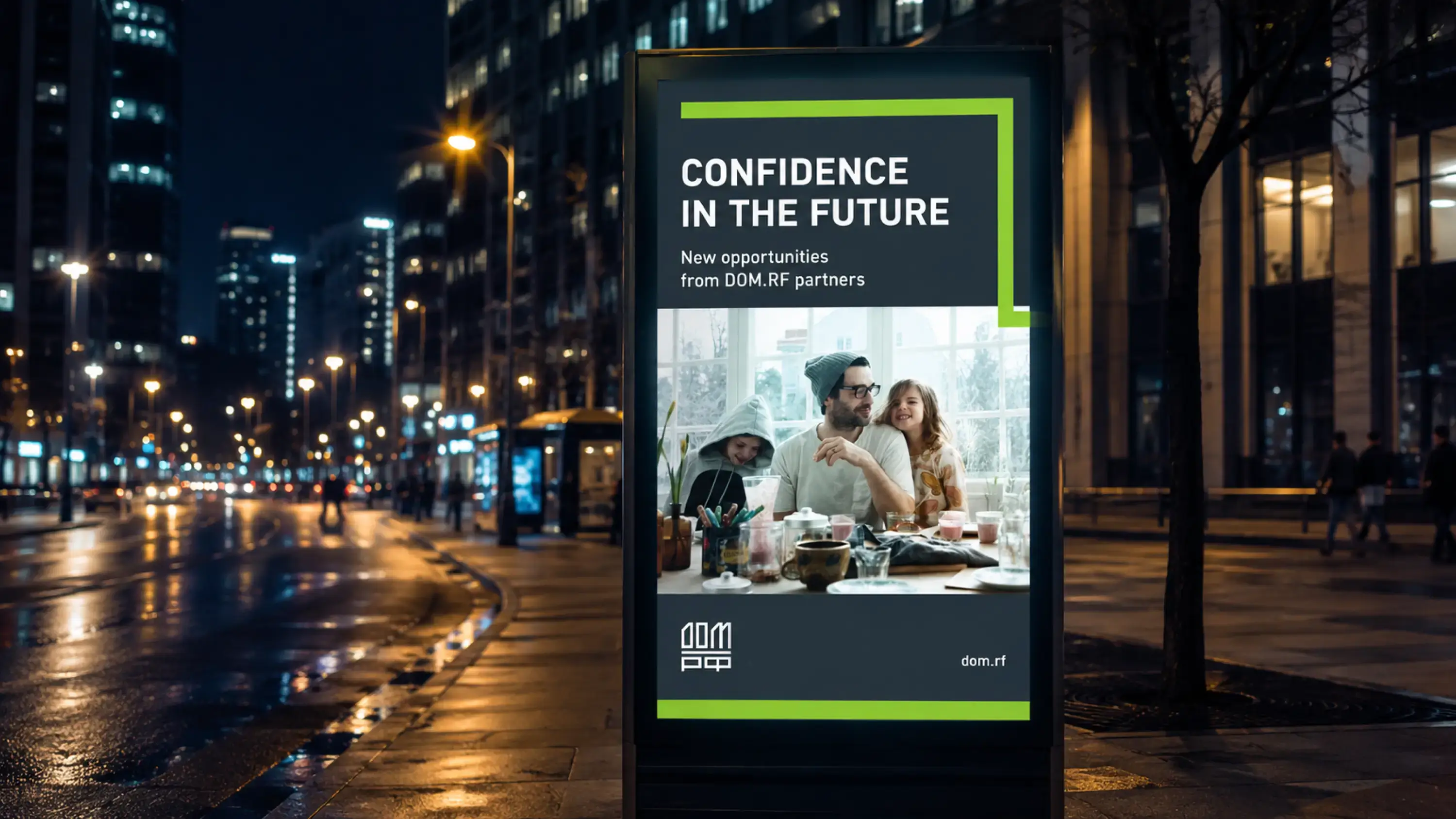
Confidence in the Future. The selected positioning idea was built around confidence in the future.
For investors, confidence in financial instruments. For banks, confidence in the return of capital. For developers, confidence in long-term financing and infrastructure. For home buyers, confidence in delivery. For citizens, confidence in stable, comfortable and dignified living conditions.
The brand had to carry this idea without becoming decorative or generic. It needed to feel institutional, but not cold. Human, but not soft. Modern, but not temporary.
Naming
A clear national idea. The decision was made to rename AIJHK as DOM.RF. The new name moved the brand away from a bureaucratic acronym and toward a simple public-facing idea.
DOM – is the Cyrillic word for “home” or “house”.
RF – refers to the Russian Federation.
Together, DOM.RF connects institutional scale with the most human idea behind the housing sector: home.
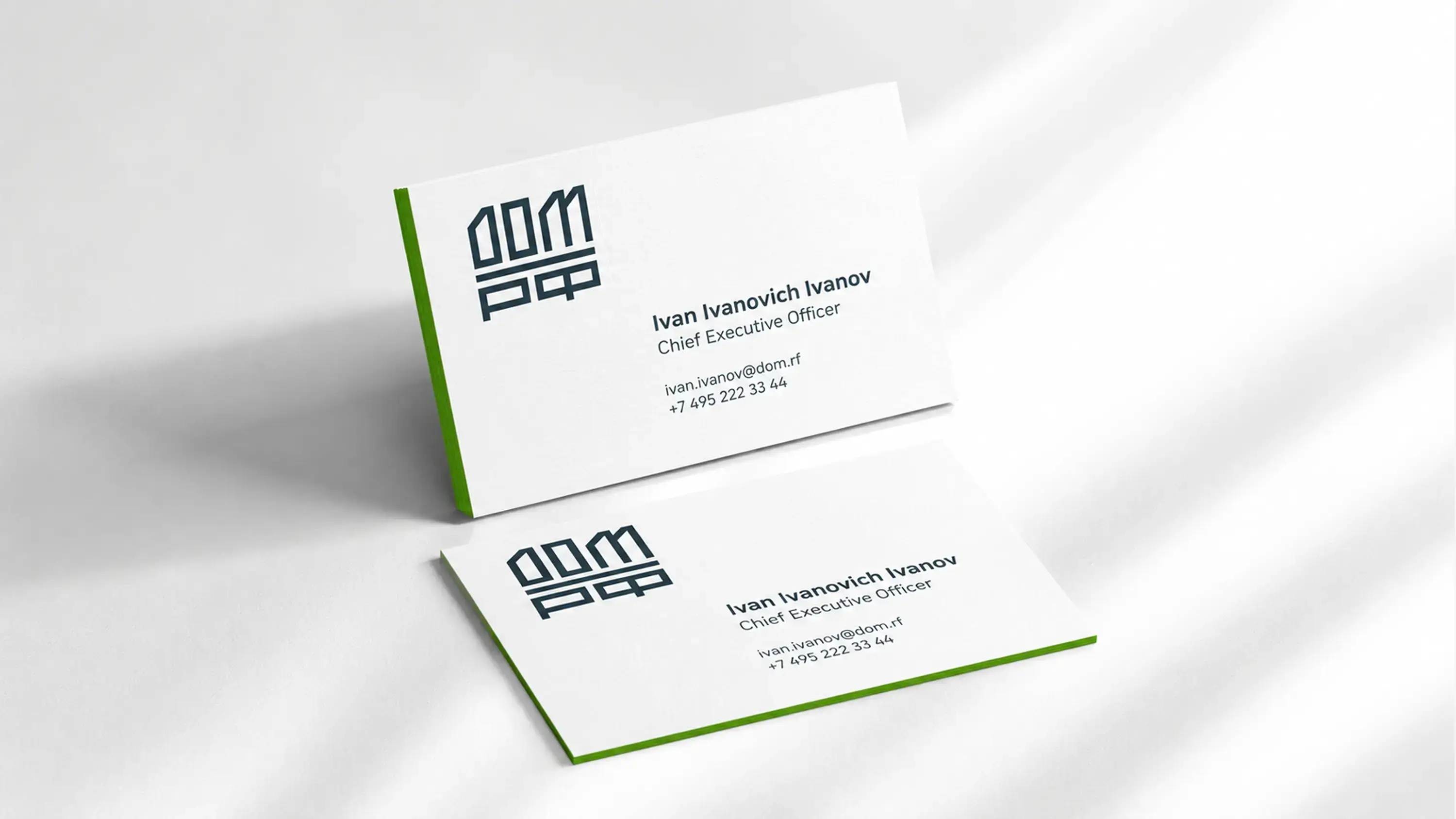
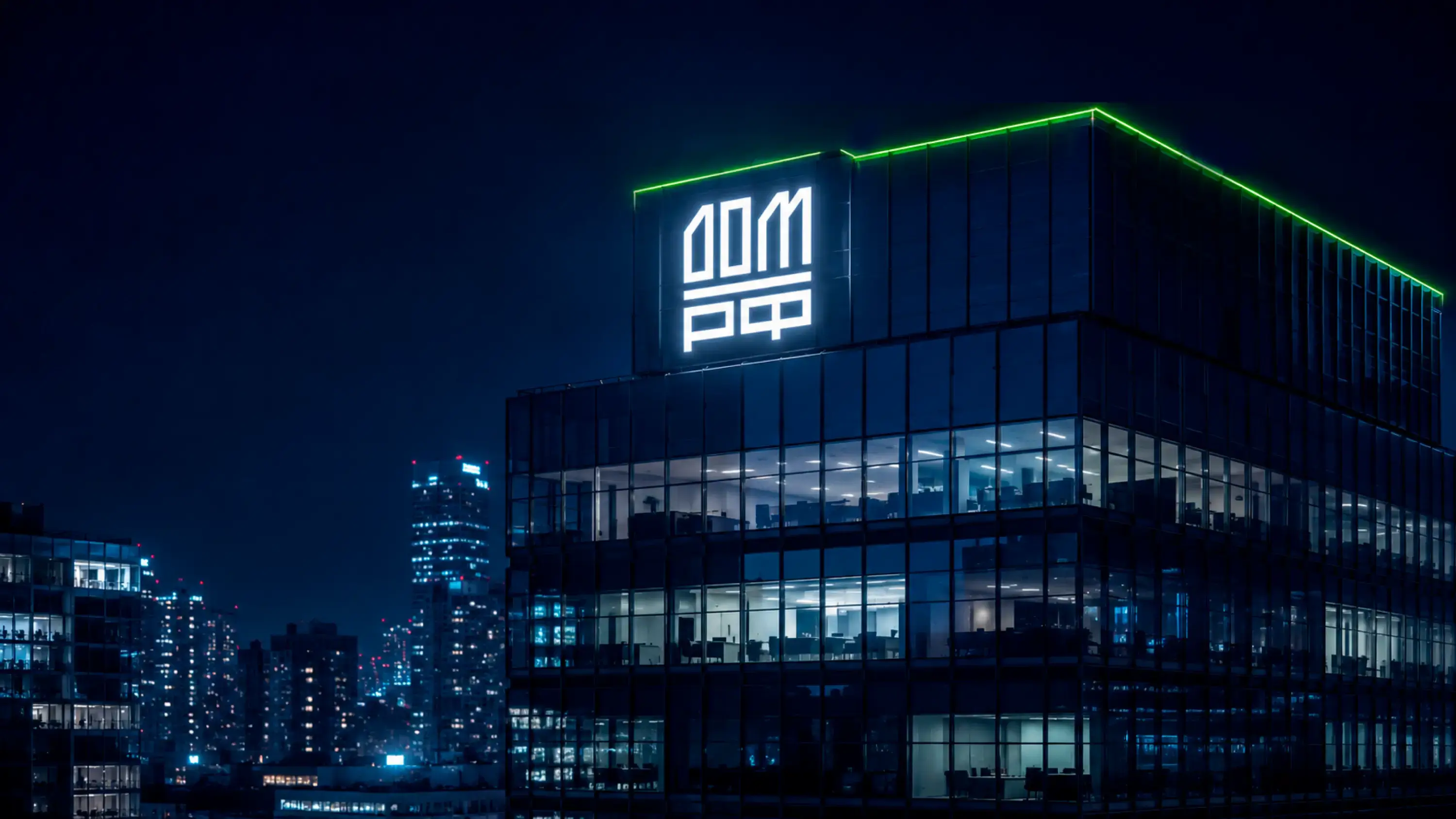
Logo
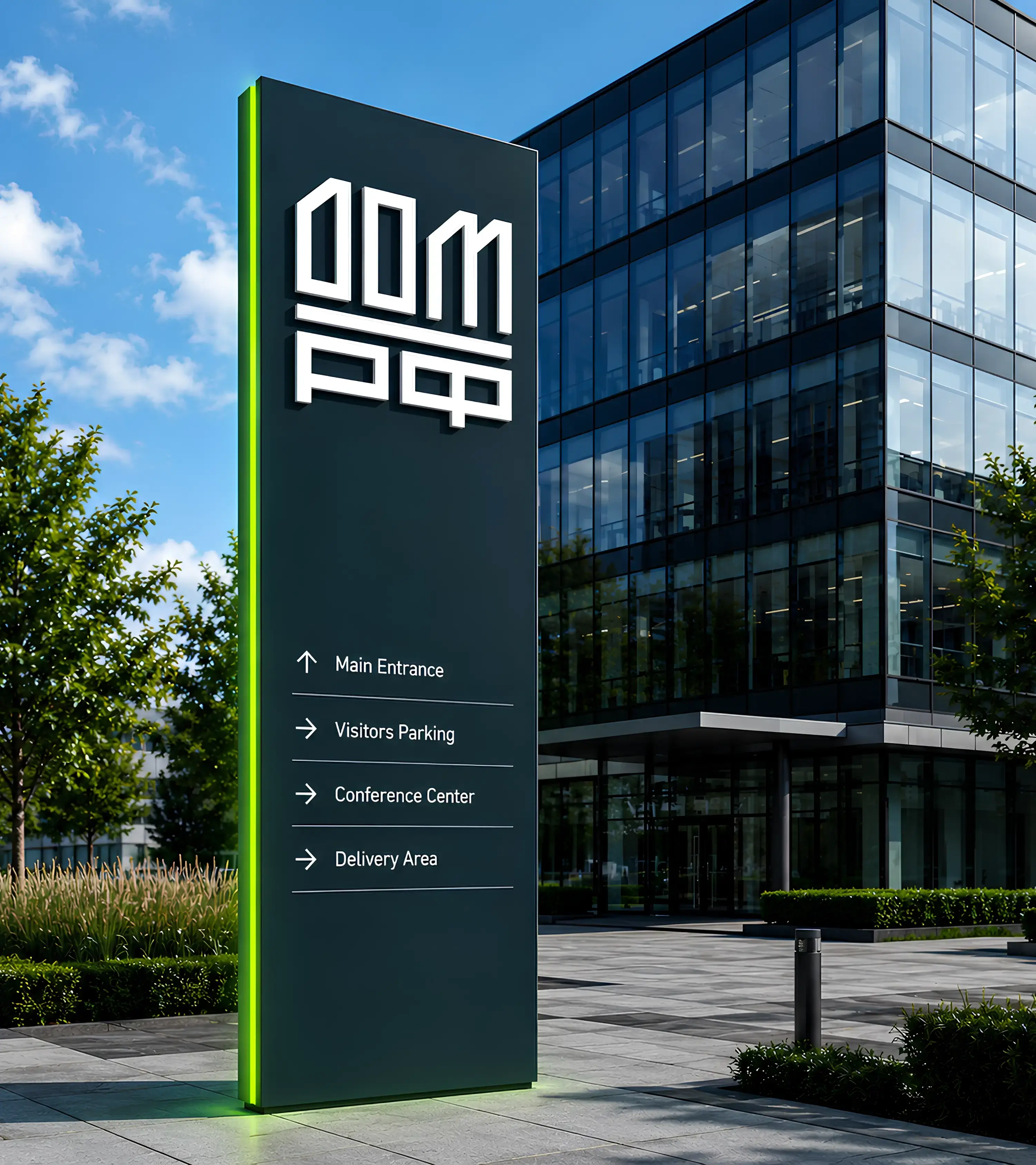
Architecture, home and country in one mark. The DOM.RF logo is built from Cyrillic typography and architectural logic. The mark reads as “ДОМ.РФ.” In Russian, “ДОМ” means “home” or “house,” while “РФ” stands for the Russian Federation. The square form suggests an apartment floor plan, an architectural structure and a stable institutional frame. The upper part creates the word “DOM” and evokes a house; the lower part anchors the identity in its national context. The result is a compact symbol for a national housing brand: home, architecture and institutional scale brought into one clear sign.
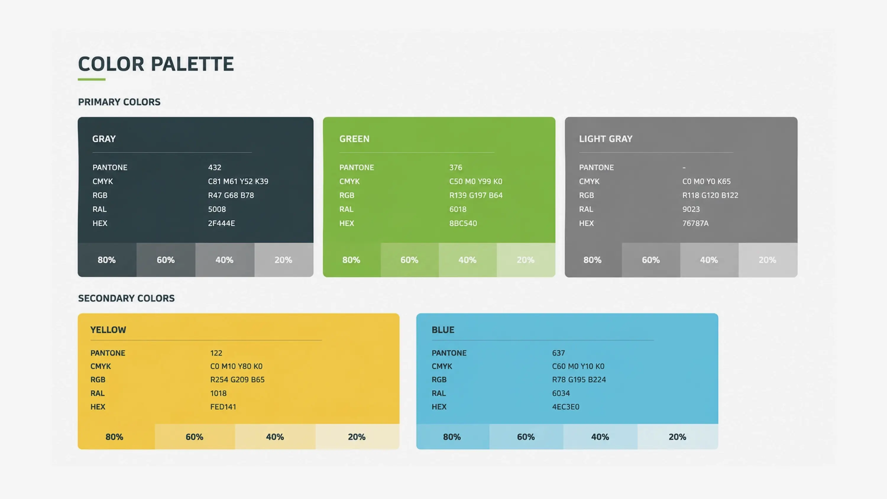
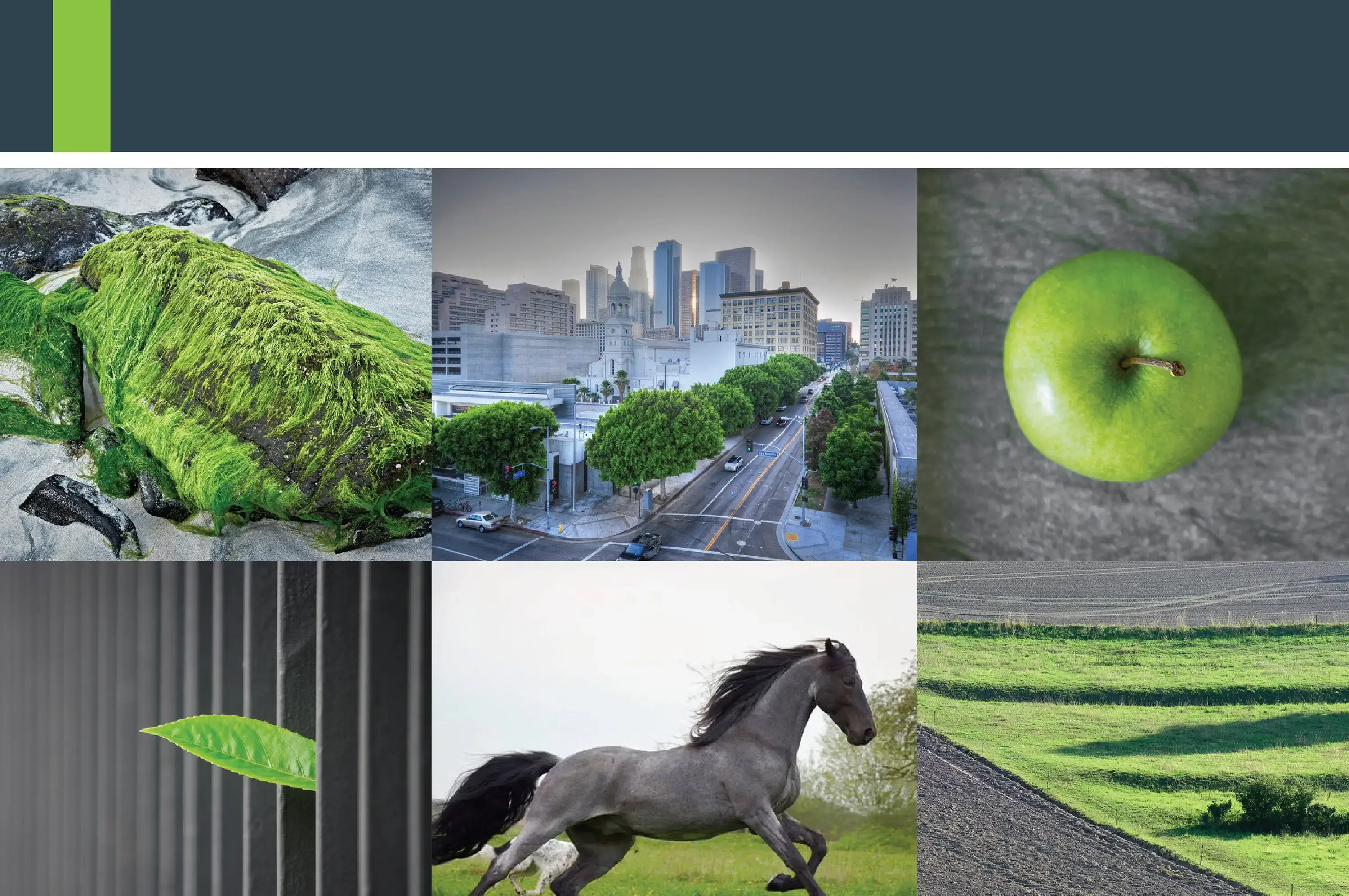
Visual System
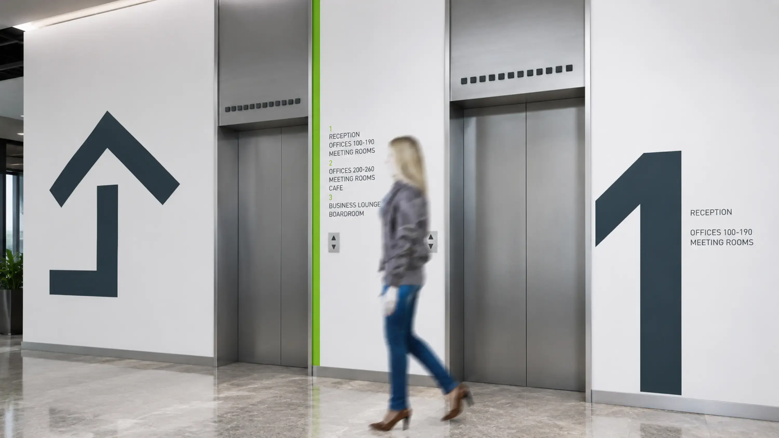
A modern city with nature inside. The visual system was built to feel minimal, urban and clear, with green accents referencing nature, living environment and the idea of a modern city with nature inside. The identity had to work across official, financial, public and internal communication. It needed to be flexible enough for large-scale use and restrained enough to remain credible in institutional and commercial contexts.
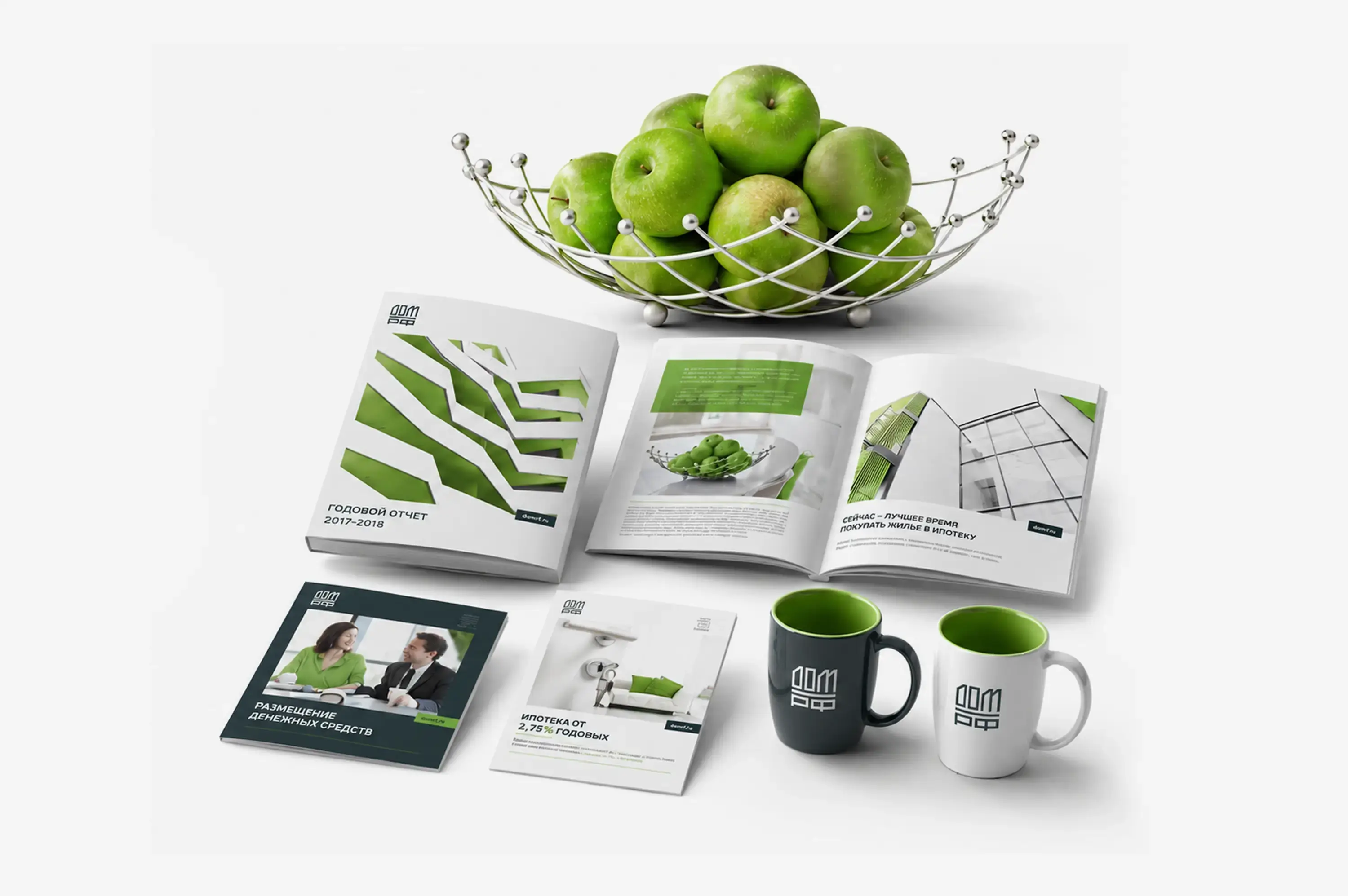
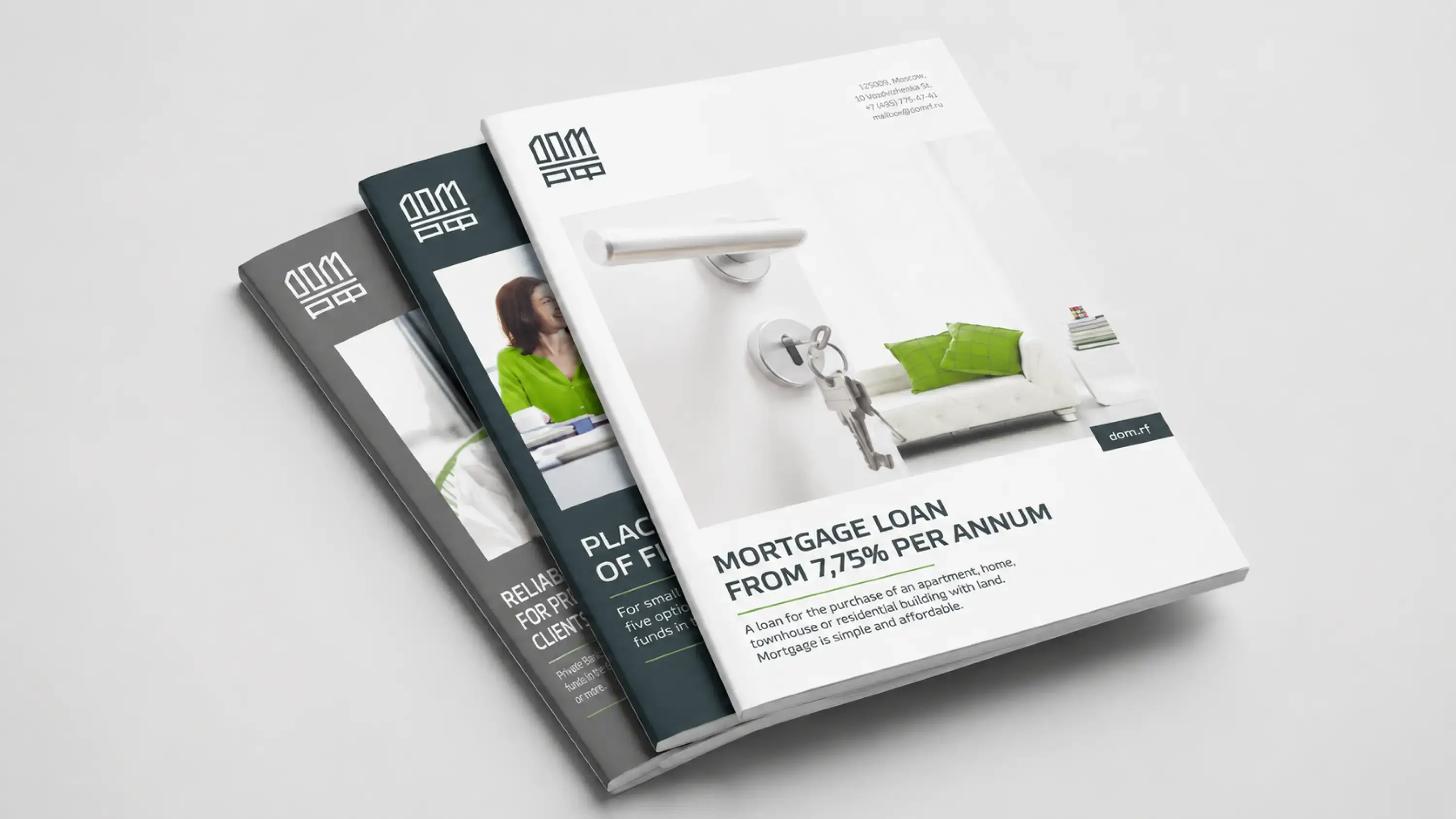
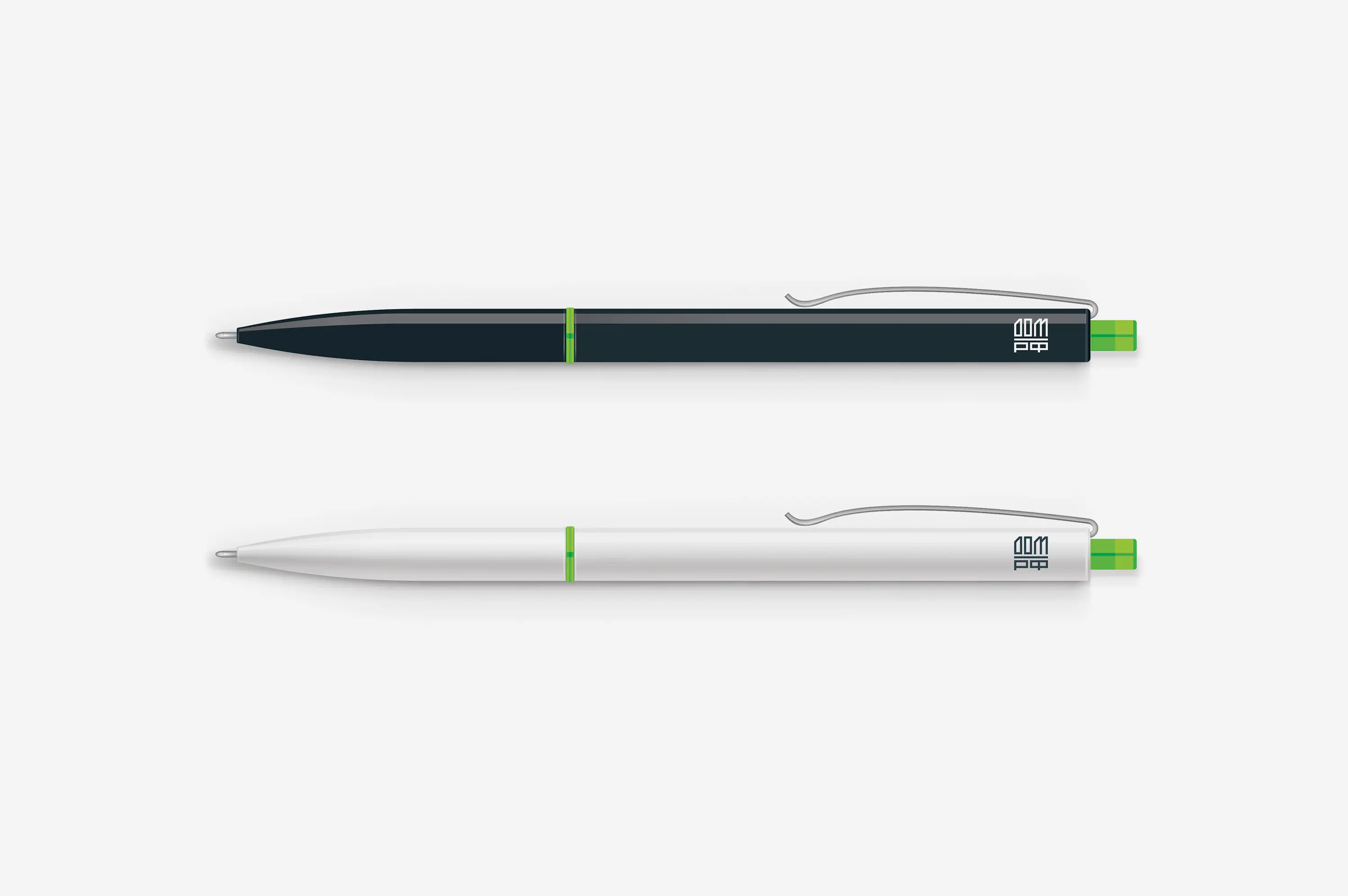
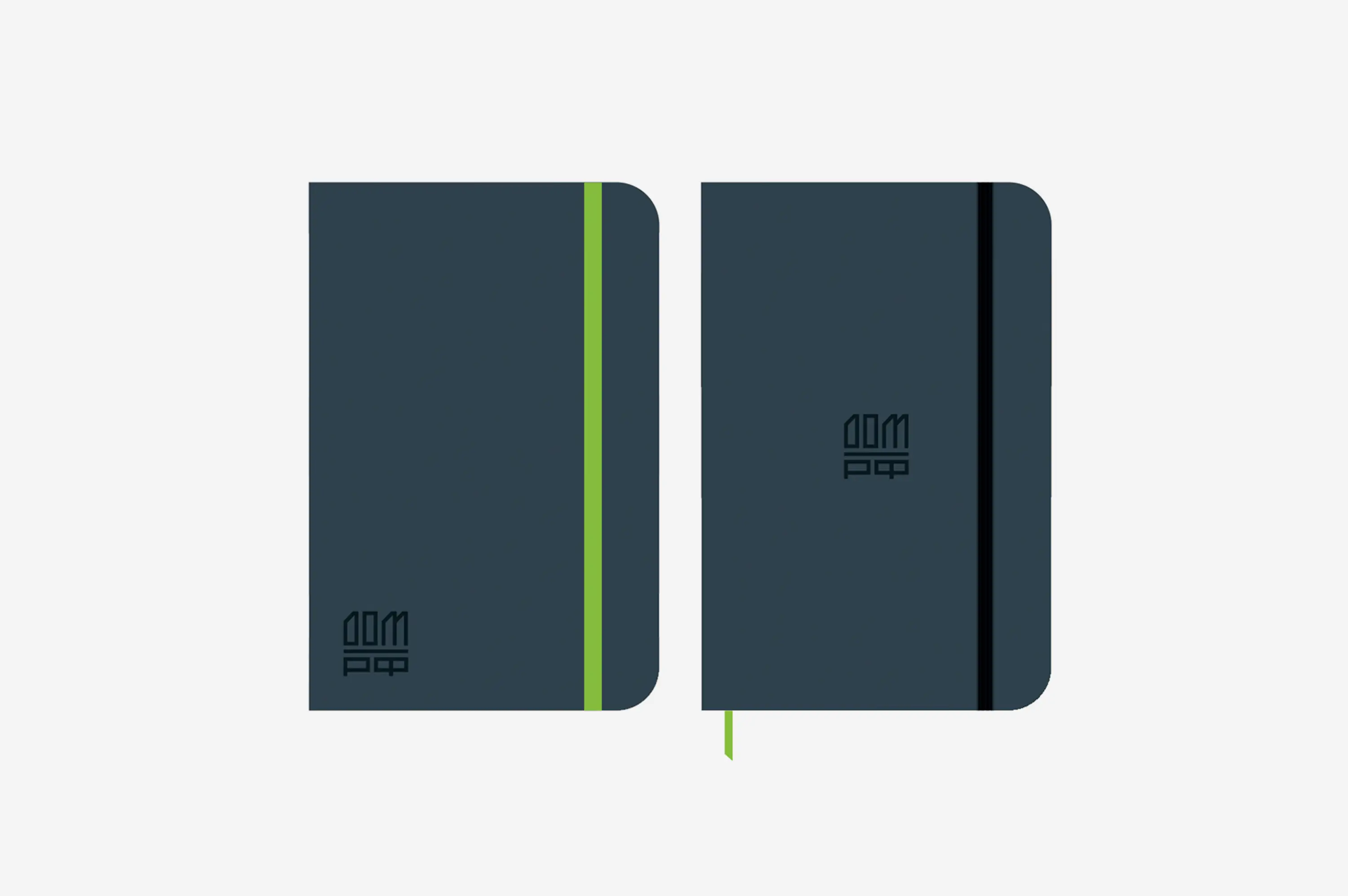
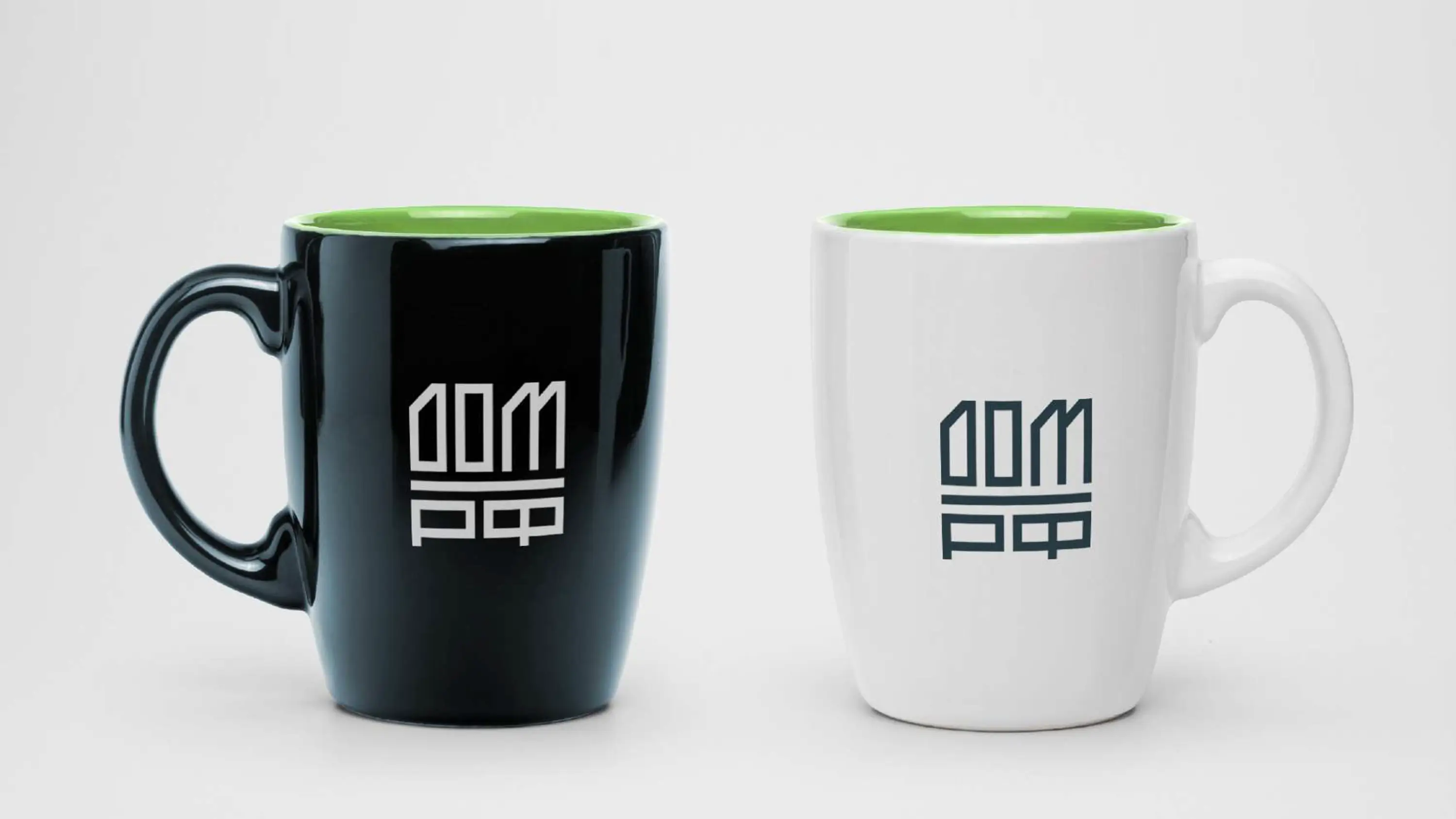
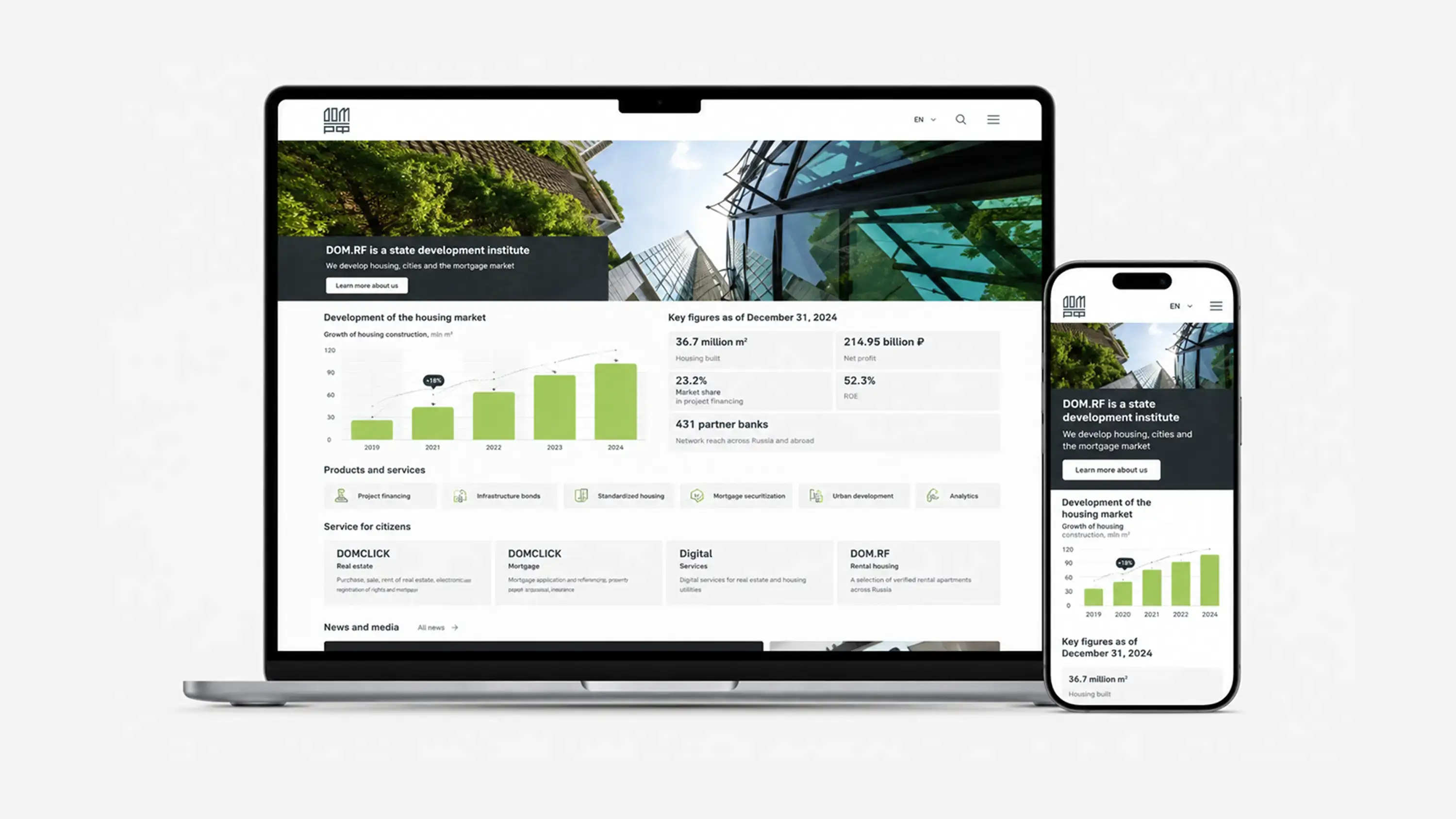
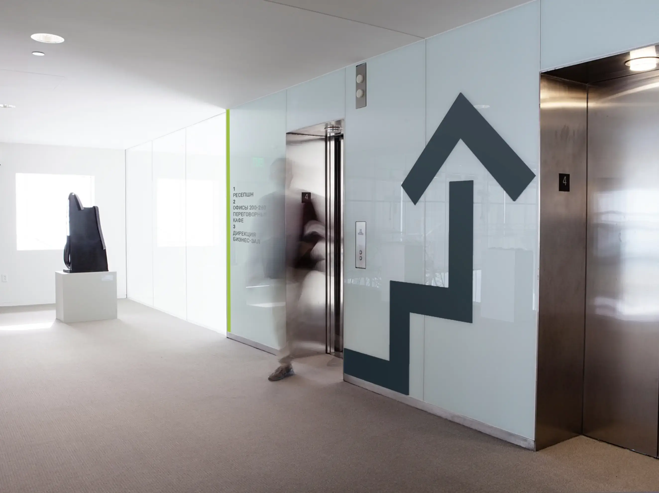
Applications
Built for real institutional scale. The identity was designed for a wide range of touchpoints: building facade, documents, website, presentations, brandbook, signage, digital products, merchandise, stela, billboards and public-facing communication. A brand of this scale cannot depend on one beautiful logo placement. It has to survive repetition, regulation, co-branding, internal teams, external partners and years of real use. The system had to remain recognizable on a building, credible in a financial document, clear on a website and stable across national-scale communication.
Result
Created in 2017, the DOM.RF identity remains visually consistent years later. For a national housing development brand operating across complex audiences and public infrastructure, this is the real test. Not how the logo looked on launch day, but whether the system could continue to make sense after years of use. DOM.RF was built on a clear institutional idea: confidence in the future. That foundation allowed the visual language to remain stable, recognizable and relevant over time. Longevity is not only a design quality. It is a strategy quality.