Context
Salair Logistics emerged as an independent business from within a major contractor to Russian Railways. The company carried a significant operational foundation: 800+ daily orders, logistics coverage across 85 regions of Russia, and a full-spectrum 3PL capability – freight forwarding, warehousing, responsible storage, and cargo handling.
The separation from its parent structure created an immediate need: build a brand capable of representing this operational scale in the market. At the time of the project, the company had no website, no identity system, and no visual language to present itself in a B2B procurement context. The name itself was under review – it didn't communicate the logistics positioning the business needed.
Challenge
The target audience is unforgiving. Procurement and logistics directors at major industrial corporations evaluate logistics partners on demonstrated operational reliability – not brand creativity. The visual language of the category is conservative by design: trust is built through consistency and restraint, not differentiation for its own sake.
The task: build a brand from zero that reads as mature, technically capable, and commercially serious across the full range of logistics touchpoints – from a business card in a procurement meeting to the side of a container at an industrial facility.
Strategic Approach
The brief was precise: mature but modern, technically capable, gender-neutral, unambiguously B2B, laconic, without unnecessary detail. Rather than treating these as aesthetic constraints, we treated them as strategic ones.
A 3PL operator's brand is not experienced through advertising – it's experienced at every operational touchpoint: the driver arriving at a client's facility, the documentation accompanying a shipment, the website a logistics director opens to track a delivery. The approach was to build a system that works consistently and authoritatively across all of these moments, and at all scales.
Identity
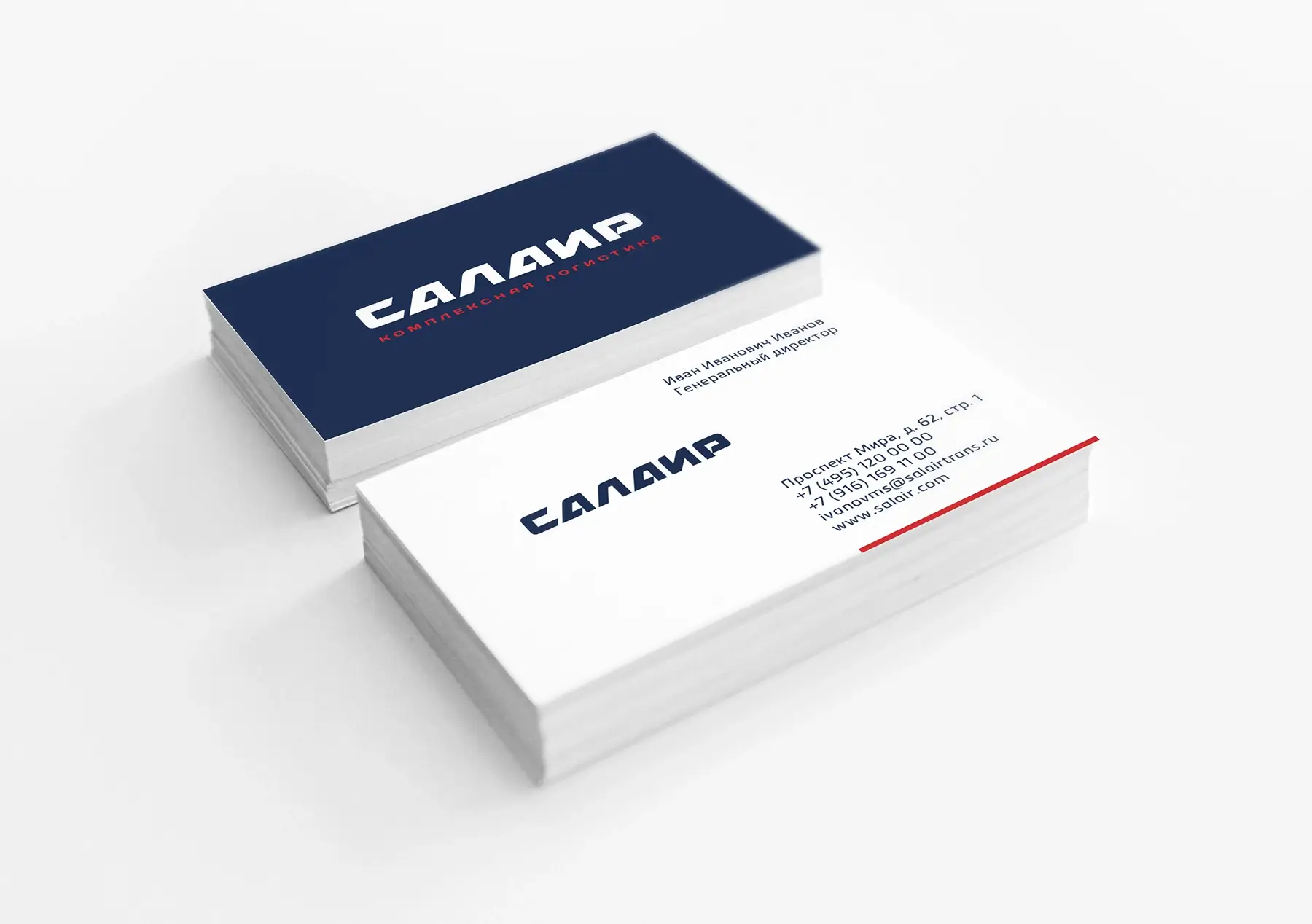
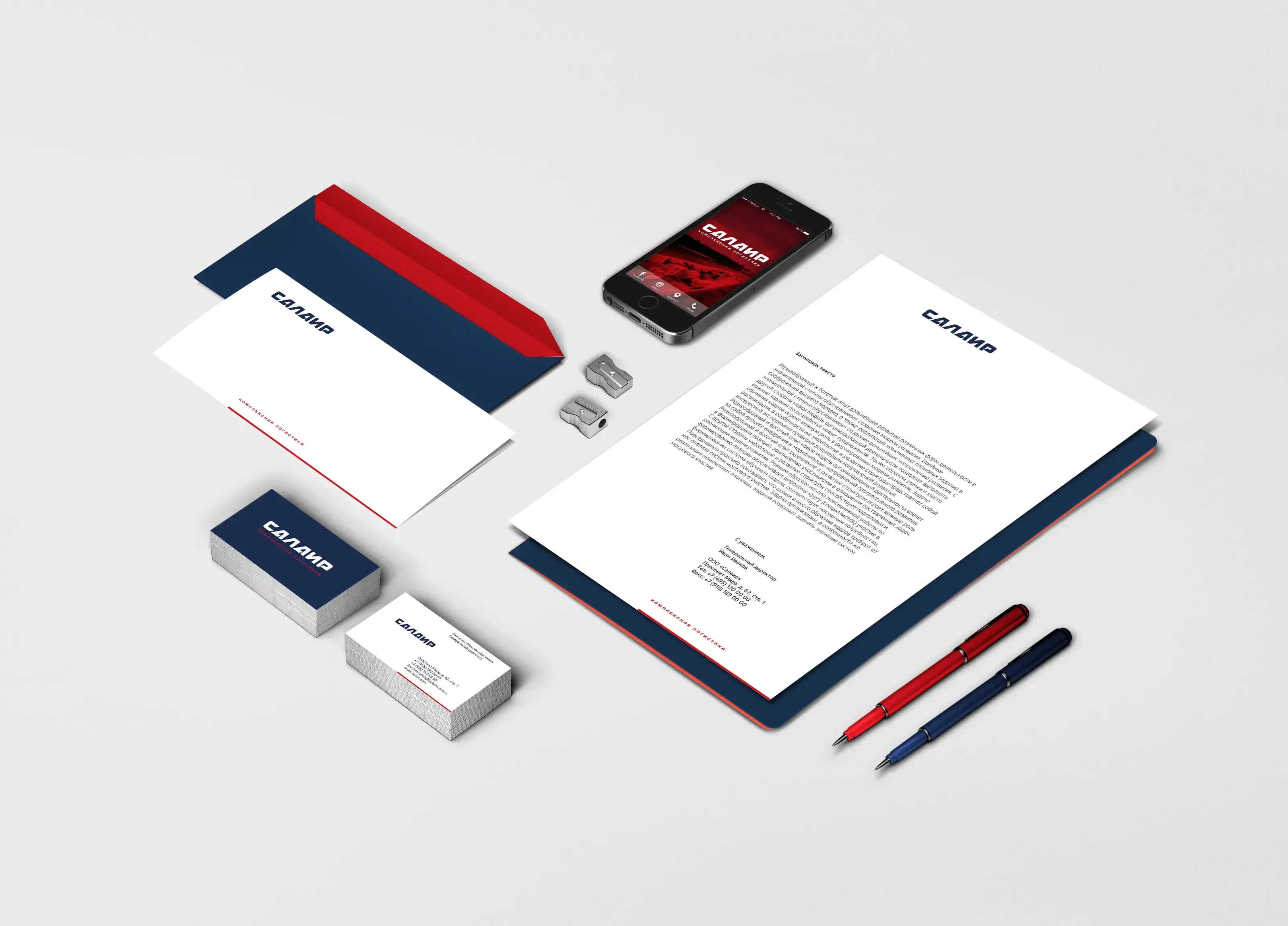
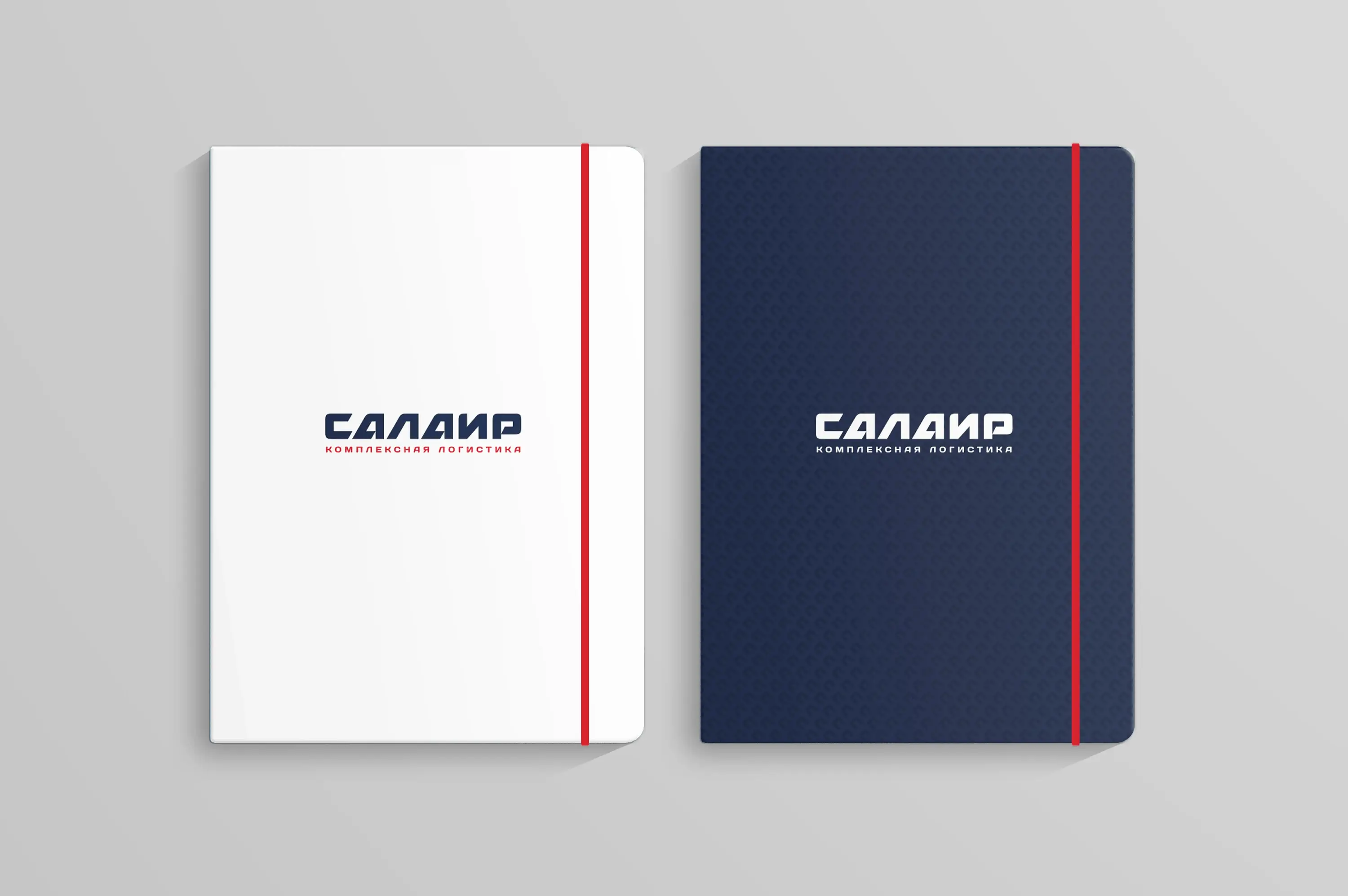
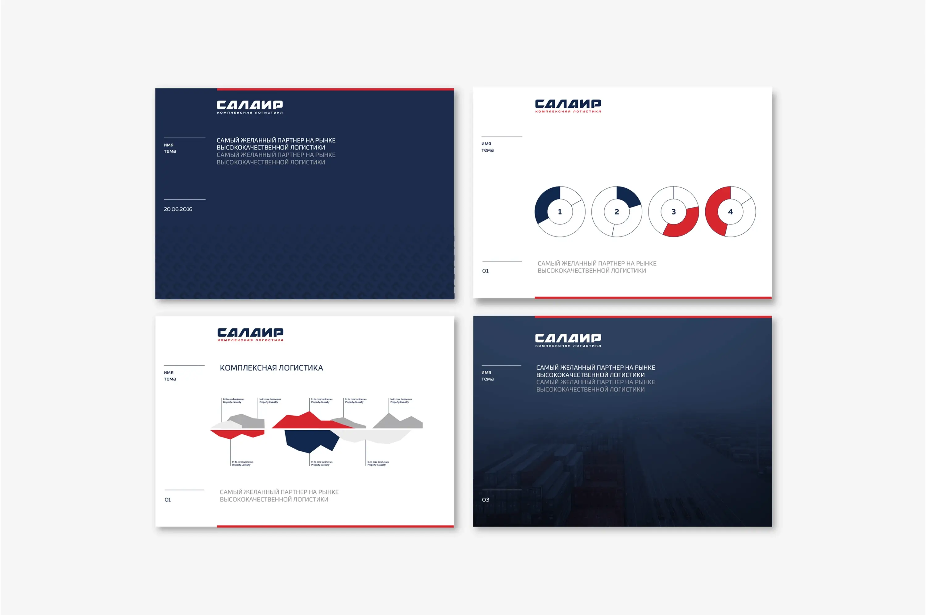
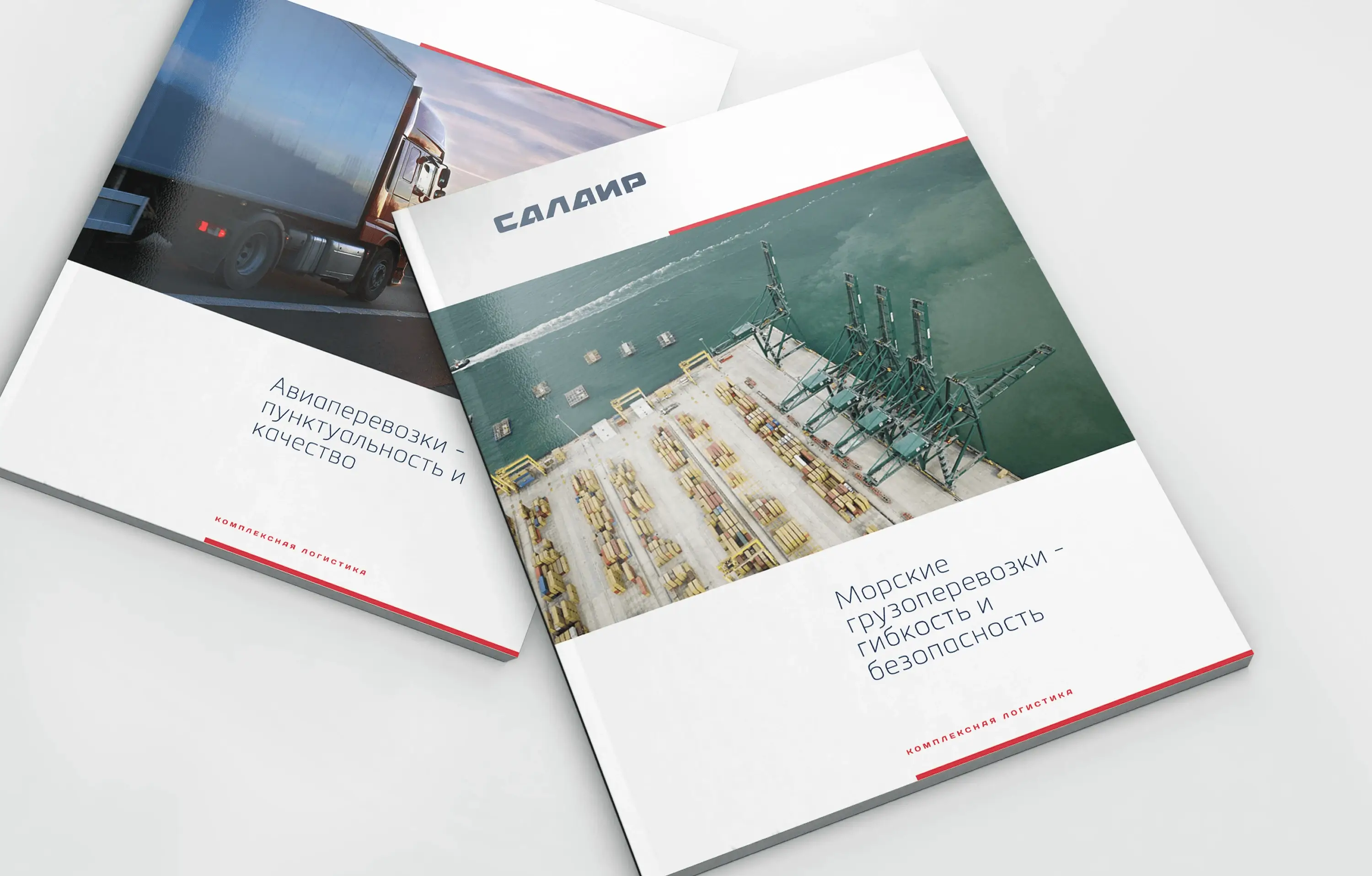
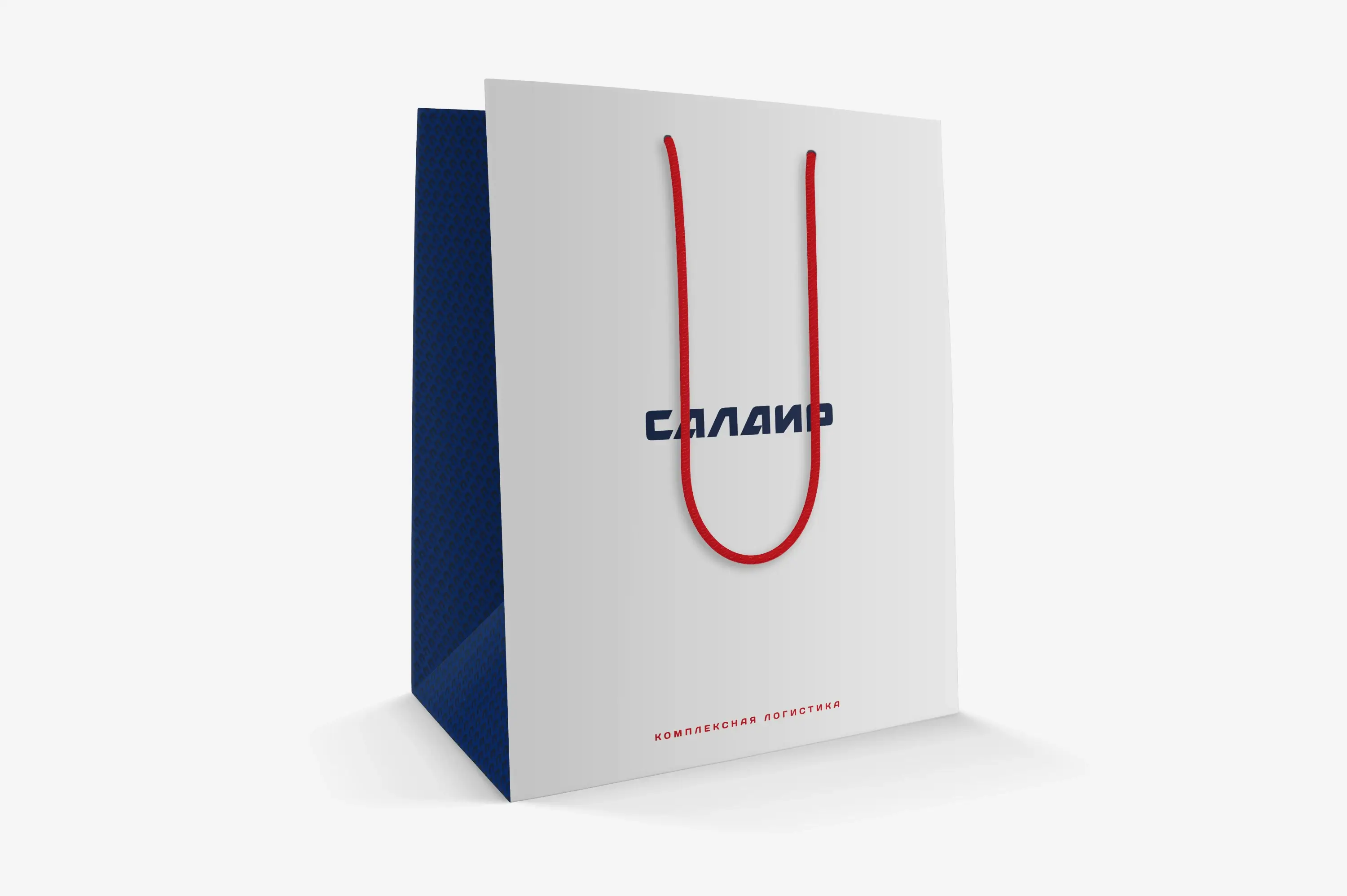
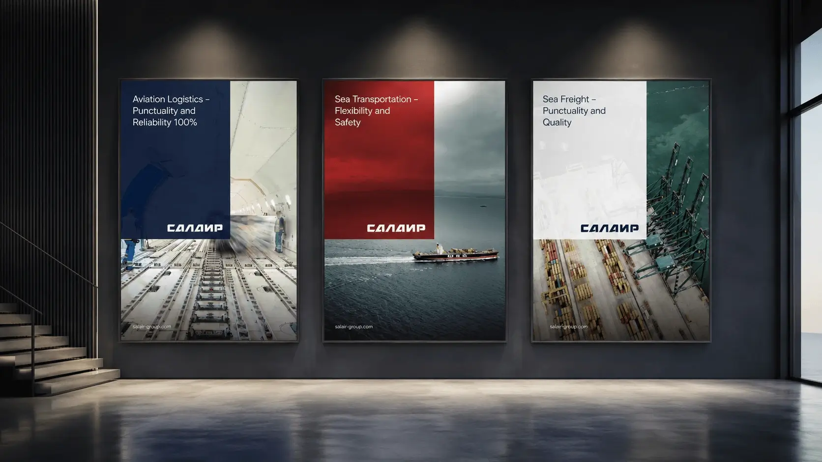
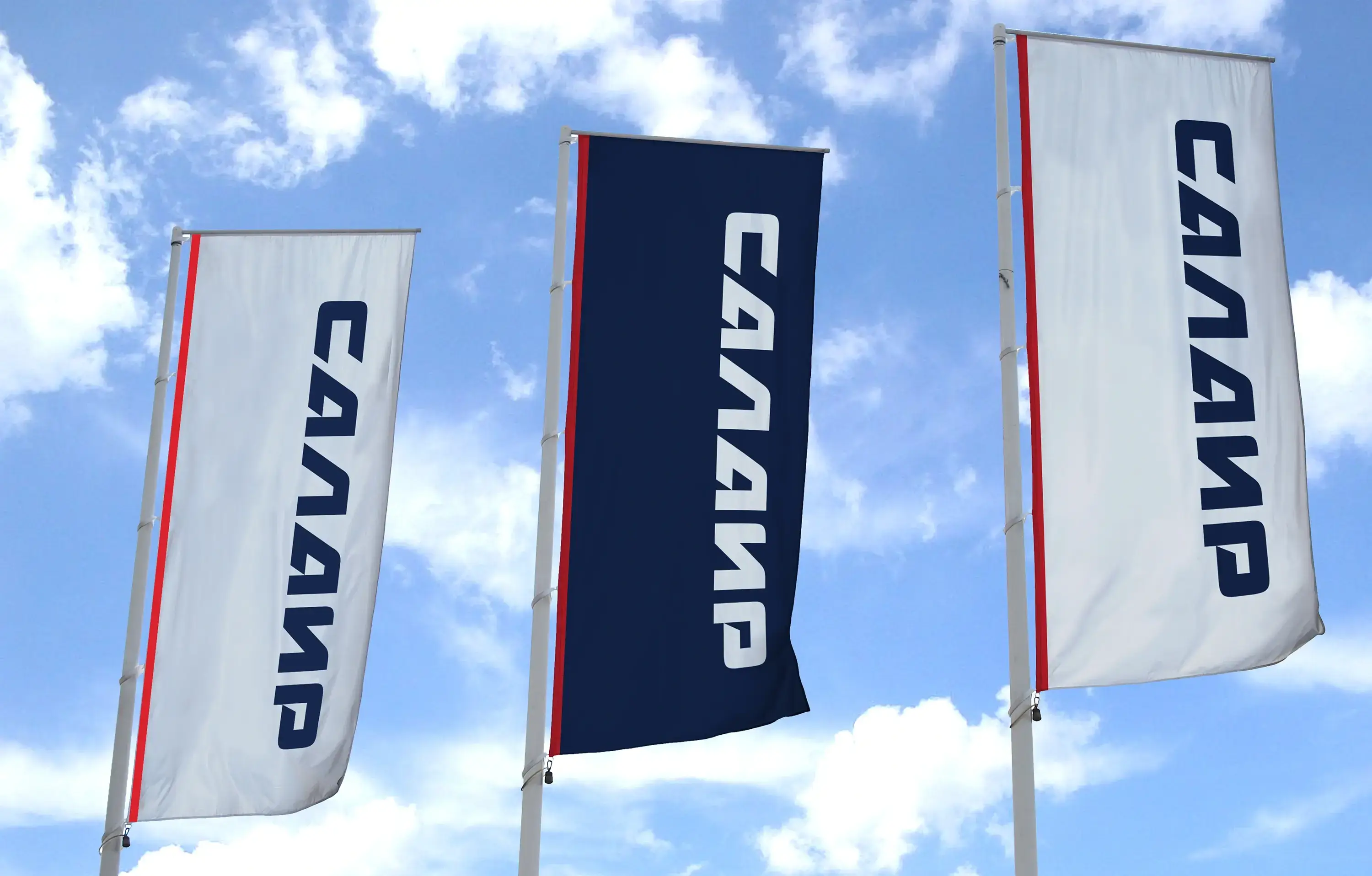
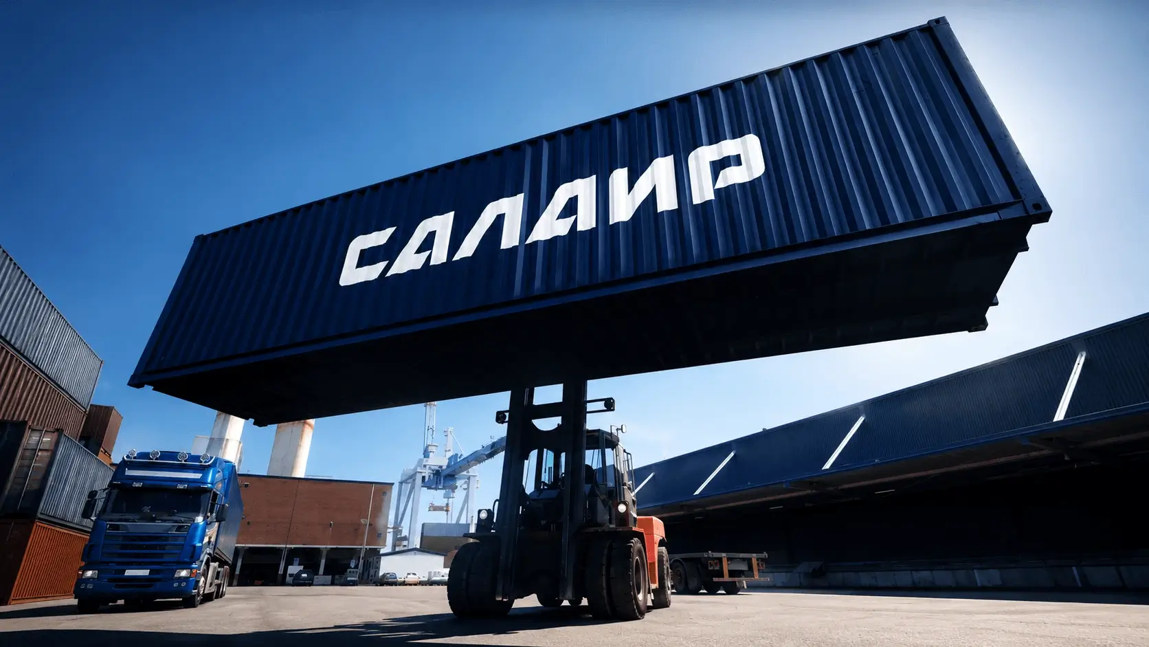
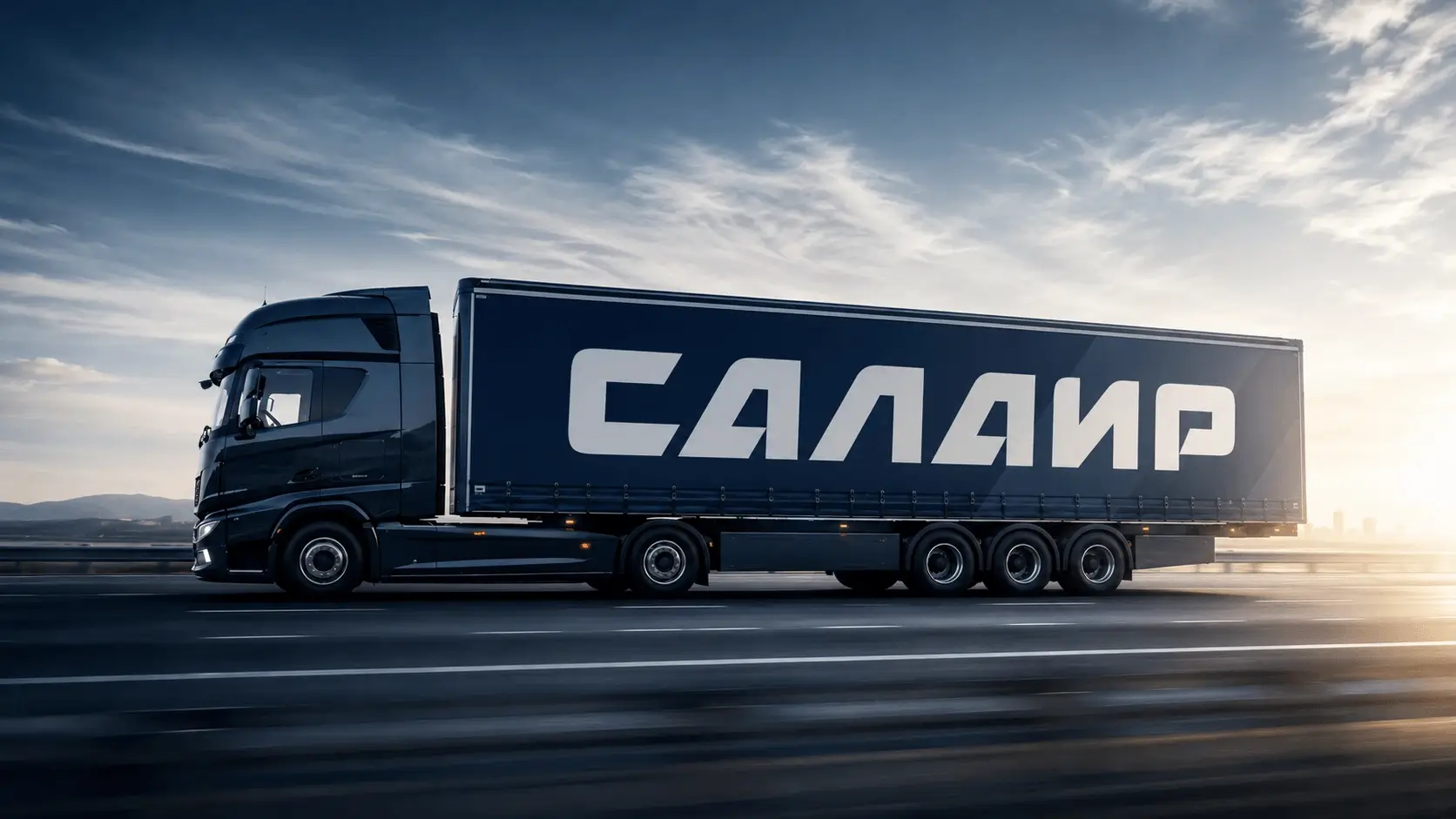
Built around restraint and operational clarity. The wordmark and symbol work together across the full logistics environment – from small-format business cards to large-scale container and vehicle branding. The palette is authoritative without being institutional. The system extends cleanly across corporate communications, print, digital, and the large-format environmental applications that define a logistics company's physical presence: branded vehicles, containers, flags, facility signage.
Applications
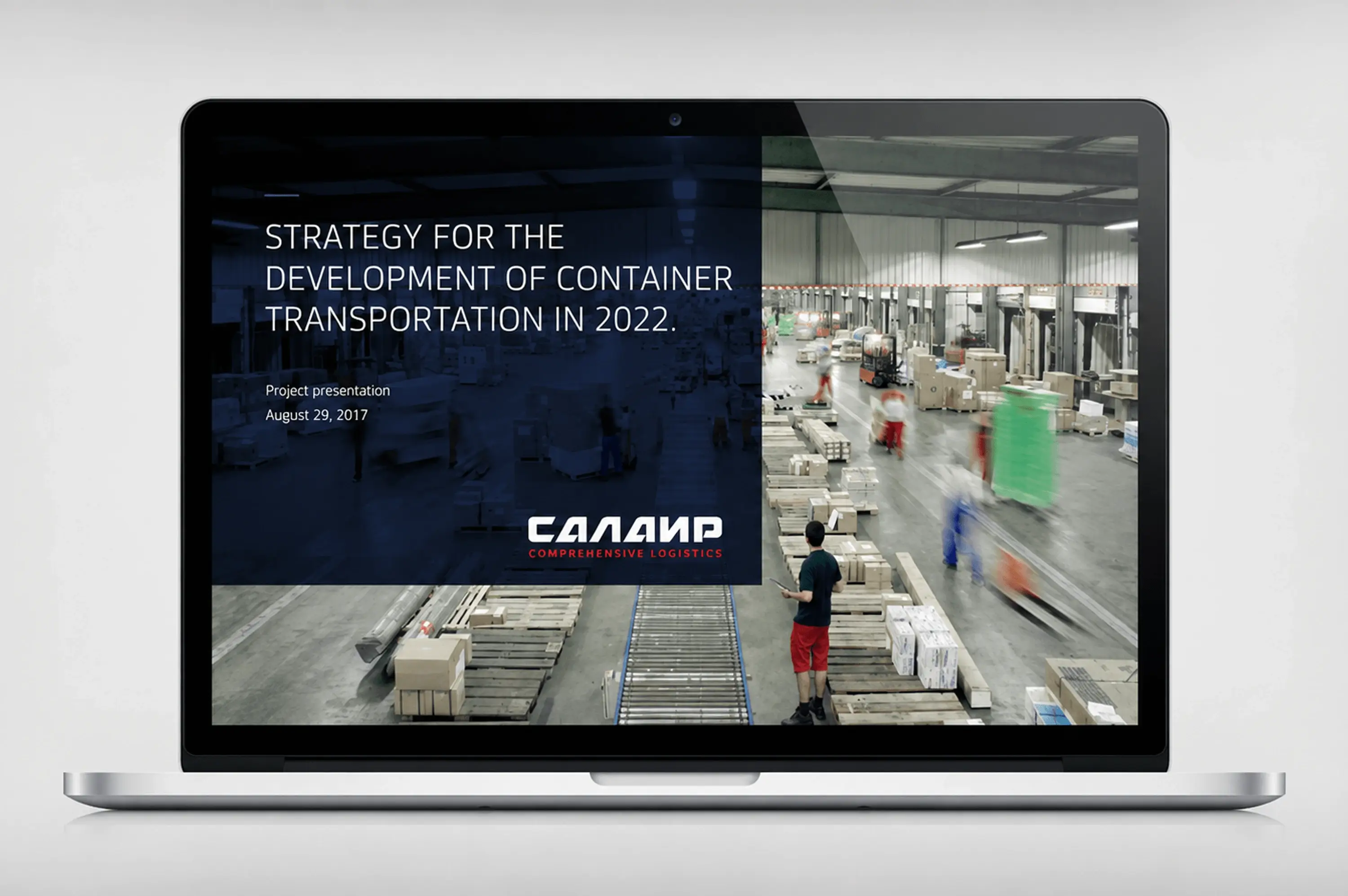
Corporate identity and stationery · Document and presentation system · Services catalogue · Website · Branded merchandise · Vehicle and container branding at operational scale.
Result
The brand was completed and delivered in 2017. A change in company leadership following the project meant the new identity was not implemented. The work exists as a complete, unrealised system – executed to full production standard, never deployed.